|
Our Kindergarten Art Show is coming up in about ten days, and students have been working hard on their projects! Here's a sneak peek at their progress so far. We are making self-portraits! Kids finished the drawings last week, and this week we have been making colorful backgrounds. The next step is to cut the drawings out and glue them on top of these paintings. The first step for the backgrounds was to arrange squares of colored tissue paper. We sprayed the squares with water and the dye "bleeds" onto the paper. Next, we added designs using q-tips and brightly-colored paint. I am hoping these works of art will be a big hit with parents! 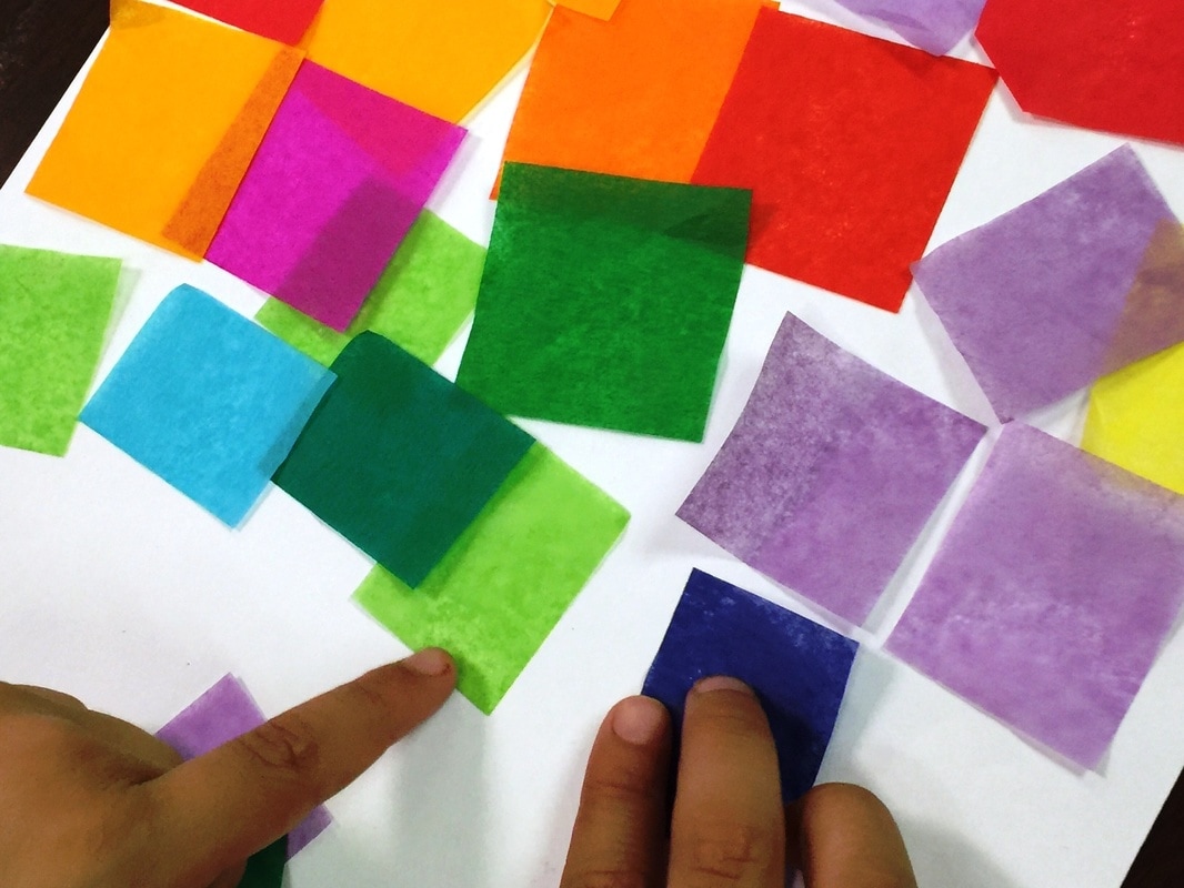   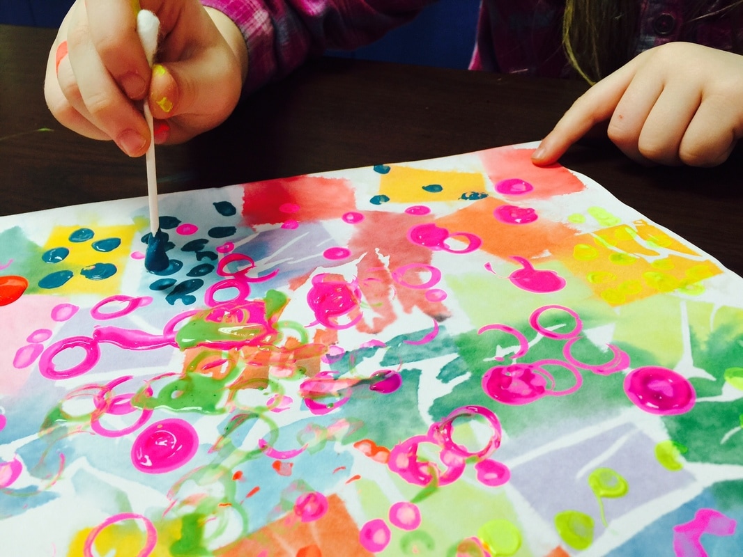
0 Comments
I love teaching kids about color and the science behind it! It's one of my favorite things to teach, so I was excited when fourth graders started that part of their curriculum recently. They have been learning all about light- white light, how it can be divided into a spectrum of colors, and how objects either reflect or absorb light so that we can see that object's color! It's confusing for kids when they hear that all the colors of light blend to make WHITE, when I've been teaching them since kindergarten that all the colors of paint blend to make BLACK! With the help of this 5-minute clip from a Bill Nye episode, I hope they are beginning to understand. Now that they are learning about the color spectrum in science, it's a good time for us to talk about the color wheel in art. My students are already familiar with the color wheel- I teach them that it's a tool artists use to organize color. I start teaching it in Kindergarten, and tell them it's like a round rainbow. Now that fourth grade has the vocabulary word "spectrum" we can approach it a little more scientifically.  If you are unfamiliar with the color wheel, here's a one-minute introductory video. This is more information than I expect my kids to know, but it is a good overview of all the reasons artists need to understand how colors work together! The goal for today's activity was for students to mix colors to make their own complete color wheel, using just the three primary colors of red, blue, and yellow. I explained the color variances using fractions- green is half yellow and half blue, while yellow-green is 3/4 yellow and only 1/4 blue. This was all explained on this worksheet I made.  The dots in each circle represent spots of paint- each student was to use a q-tip to dot the correct color and amount of paint, then mix it all up to make the color! I told them it was kind of like following a recipe when cooking.    Here's an example of a completed color wheel.  The last step was for students to write some "color recipes" using fractions. This ties in very well with their current math focus.   They did a great job, and I hope this helped them better understand light, color, AND fractions!
Fourth grade artists took a trip back in time to experience how art-making would have been in the early years of our nation! They designed a house in the colonial architectural style and drew it using materials similar to what would have been used back then- a quill pen made from a feather!  The main characteristics of a colonial house are:
 We watched this video, which took us on a tour of a historic home in Philadelphia. Built in the 1750's, the Woodford Mansion is now a museum dedicated to preserving and showcasing life in the past. Students used a quill pen made from a real feather to make these drawings. They decided they were very grateful to live in a time when pencils and erasers are available- it was hard not being able to erase mistakes!    And here are some of the finished products!         To make the drawings look authentically aged, some students crumpled the edges and added stains. This step was optional- after working so hard on these drawings, some just couldn't stand to crumple them up! I hope this experience was memorable for students, and that it helped them be able to picture life in colonial America!    I am very pleased at the amount of success students had with this project! We began these paintings when third grade was in the middle of their unit about rocks and minerals. They experienced an in-school field trip where they got to go mining for real gemstones! Each student took home a collection of beautiful rocks. The students were so excited when I told them they would get to design their own crystals!  One of my favorite parts of this project was that I got to sneak in a lot of math skills. Students got lots of practice using rulers, though we used them more for making straight lines than measuring. We also talked some about lines, line segments, and vertices. I also briefly reviewed types of angles with them. Also, this drawing process was more complicated than our usual projects, so it was a good opportunity to practice following multi-step directions- which is a critical test-taking skill! After the crystal drawings were completed, then we talked about color. Students were required to plan a specific color scheme for this project- they couldn't just pick whatever colors they wanted. They needed to select a group of three analogous colors- these are colors that are all together on the color wheel. These were the colors of paint they would use. Next, students had to identify the complement of their analogous colors. Complementary colors are directly across from each other on the color wheel. It means they are like opposites. For example, red and green are complements, and I tell students that when you put red next to green, it makes the red look the "reddest" it can look. And green next to red makes the green look even "greener."  Students first used a crayon in the complementary color to color a few sections- this was our "accent color". Next, they painted the other spaces with the analogous colors. Can you see how the contrast makes each color "pop"? 
To give these crystals a little sparkle, students traced their lines with metallic markers. And it's hard to tell in the photos, but there's also a little glitter added to some of the spaces! The last step added a little scientific flair- students pretended this was a new gemstone they had just discovered, and they had to give their stone a name, tell how much money it was worth, and also tell one interesting fact- maybe something about how the stone was formed, where it was found, or how old the stone was. They came up with some really creative answers! Hendrix is participating in "The Great Kindness Challenge" this week. Each day students are encouraged to do a kind act for someone at our school or in our community. Students have made cards and banners, created homemade gifts, and collaborated on this beautiful display!  These colorful cards were created by several 1st and 2nd grade classes. The students explored color relationships and how new colors are made. Each student used only three paint colors (red, yellow, and blue- the primary colors) and mixed them to create orange, green, and violet (the secondary colors). They were encouraged to try different color combinations. The result is this beautifully unique rainbow!  Each class has discussed what it could mean to "be a rainbow" for someone. We talked about how if someone is having a hard day, your kind act could be all they need to turn their day around. Just like a rainbow at the end of a storm!    * I can't take credit for this idea- the design is based on a bulletin board I saw online, and we made our own version! Here's the original: https://www.pinterest.com/pin/166773992427772517/ Second grade is in the middle of a unit about weather. Part of their instruction involves identifying types of clouds- cumulus, cirrus, and stratus. What could be a better way to learn how clouds look than to go outside and observe them? So we took our painting supplies and headed outside to observe and paint. Fortunately, the weather cooperated for most classes! A couple of classes did not get to go outside yet, but they will have a turn in the coming weeks.     Here are some finished paintings!  Art Club continued developing their basic drawing skills through sketching these geometric forms. Each student arranged their own variety of forms and then drew them as accurately as possible. I encouraged them to pay attention to lines and angles as well as where the shapes touched.  Here is an example of a student's view. After sketching the forms, students then had to add value to their drawings to show the shadows and highlights. Finally, they made a second drawing, this time in color. The students did a beautiful job, and I continue to be amazed by their growth as artists!         This week's schedule was a little off due to our snow days. First and third grade classes were due to start a new project, but I wanted to hold off until all classes could start the same week. So we used this week for some extra practice with making narrative art- art that tells a story. My favorite master artist to show when discussing narrative art is Norman Rockwell. His pictures are so fun for students to interpret. We began the lesson by studying his painting "Roadblock".  "Roadblock" Cover for Saturday Evening Post 1949 We looked at the artwork and I asked them to answer some questions. They had to find clues in the picture to answer each question. First they had to identify the problem in the scene, and describe the main characters. Some of the other questions were really challenging! One of my questions was "What time of day is it in this scene?" and they decided it had to be morning because the kids had their bookbags and were walking to school. I asked why they couldn't be coming home from school instead, and they said it was because the lady on the balcony still had on her apron from cooking breakfast and her husband wasn't dressed in his work clothes yet. What a smart interpretation!!  Next, students completed a worksheet with the same questions on it. They had to think of an event from their life and answer the questions based on that event. Then, they had to find a way to make all of their answers evident in their drawing. For example, if it was a hot day, how will you show that? Are people sweating? Are they wearing summer clothes? Could you draw the sun really big? I wanted them to include details they might normally forget about- what the weather was like, the types of clothes people were wearing, even body language and facial expressions. These are first grade examples. We will complete their drawings next week, and if we have time, they will write a paragraph explaining their drawing. I am hoping that by focusing on drawing with more detail, they will be encouraged to write using more detail.   And these last examples are from a third grade class. They were able to get more accomplished in one class period, so their drawings are more complete.    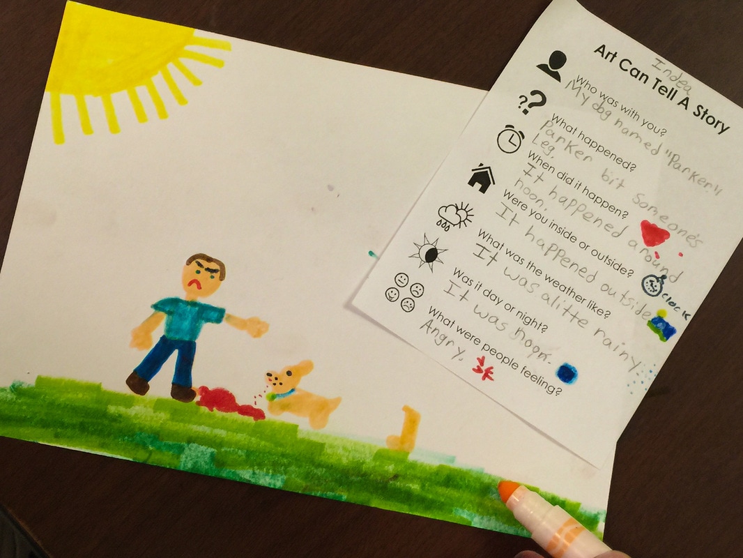  I was so thrilled with the work Art Club students did on last week's paper curl drawings, and this week I wanted to challenge them with something even more advanced. This activity builds on the work with value and shading that we've done all year. Instead of shading a simple form though, the students had to observe and replicate the shading of folds of cloth. For most students, this was their first time experimenting with charcoal, which is an added challenge. This is really a high-school level drawing activity! In fact, I even had to do a project on drawing cloth when I was getting my art degree in college! So the fact that fourth grade students could begin to have success with this is very impressive. They still have lots of room to grow, but I am very proud of their beginning attempts.         Second grade students have just begun a new IB unit involving weather. This week's learning has been all about air. To go along with this topic, we painted with air in the Art room! Each table had some watered-down paint and some eyedroppers. The goal was to get the paint on the paper and then move it around using ONLY air- no brushes, no fingerpainting. I demonstrated several ways of using air (blowing gently, blowing concentrated air through a straw, fanning a puddle with a piece of cardboard) and then it was the students' turn to experiment! 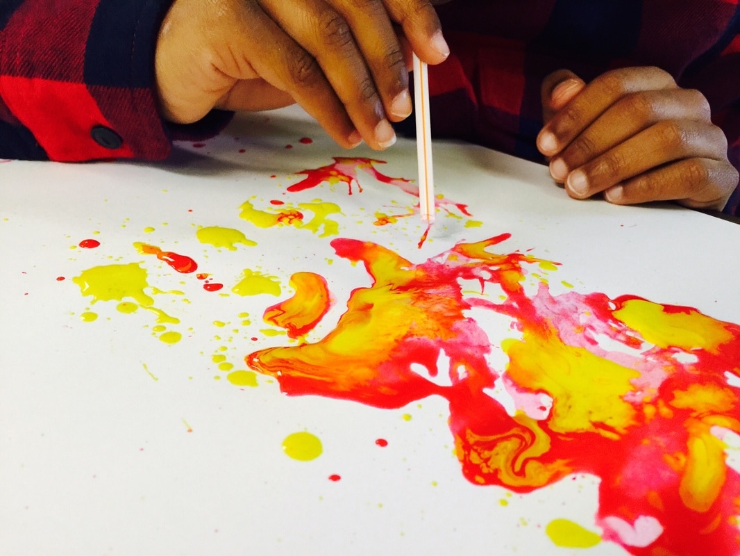     After a few minutes, I stopped them and we had a quick discussion. I asked them what they noticed about how the air worked. One student volunteered that if you blew gently, the paint moved slowly, and if you blew really hard, the paint moved very fast and spread out much further! I was really proud when a student used the word "force" to describe the difference!
Then I asked them what they thought this had in common with weather. They immediately connected it to the wind. We compared the force we used to blow the air to the wind's strength during different weather conditions. They were able to make comparisons between the gentle blowing being like a calm breeze, and the forceful blowing being like hurricane-level winds! We also had to talk a little about color theory... I had given the students red, yellow, and blue paint and the colors swirled and mixed as it moved on the paper. We had a quick review of the concepts behind primary colors (red, yellow, blue) and secondary colors (orange, purple, green- the colors that are made when the primaries mix.) It was a fun day with lots of memorable learning! |
Archives
March 2018
Categories
All
|
 RSS Feed
