 This lesson was very interesting to reflect on. I did the same activity with both my fourth graders AND my kindergartners! My goal for my kindergartners was simply for them to realize that our human bodies are put together in a particular way- we have heads, torsos, and limbs. Young children often draw bodies in ways that don't make sense. Sometimes they draw big heads with tiny bodies underneath, or they draw normal-sized heads and torsos, yet scrunch the legs up to be very short. Or sometimes they even draw the arms and legs coming out of the head, skipping the torso altogether- like a Mr. Potato Head. These are all normal developmental stages that children naturally progress past. Through our practice in studying and drawing these manikins, I just wanted them to THINK about what they were drawing.       I repeated the same drawing activity with fourth graders. My objective for this lesson was a bit more specific. This grade level is beginning a new IB unit centered around the concept of "Structure"- how things are put together. They'll be investigating this concept in a variety of different subject areas. Through observing and drawing these manikins, I wanted students to think about the "structure" of the human figure- how our bodies are put together. They've studied the skeletal structure of our bodies in Dance, and learned how our muscles are connected to the bones, and that moving them together is what allows us to hold ourselves up yet still flex and bend. This drawing activity is an extension of that prior learning. Much like the kindergarten students, I wanted fourth graders to draw with accuracy in representing the head, torso, and arms and legs. As these students are quite a bit older, their drawings are much more realistic and have better form. I started each fourth grade class session by showing students examples of the kindergarten drawings- I challenged them by pointing out how much detail the younger students could capture, and said that if a five-year-old can draw like this, show us what someone twice that age could do! Here are my fourth graders at work:      
0 Comments
We don't often do holiday-themed projects, but this color-mixing experience allowed students to add a festive twist if they wished! This lesson was inspired by one of my very favorite books, Hailstones and Halibut Bones by Mary O'Neill. It's a book of poems inspired by colors! Here you can read a few examples or listen to a recording of the poems. My favorite is the one called What is White? Here's part of it: "White is marshmallow and vanilla ice cream and the part you can't remember in a dream. White is the sound of a light foot walking White is the beautiful broken lace of snowflakes falling on your face."  The poems use beautiful figurative language to describe qualities of each color. The poems often describe the colors as having a taste or a smell, and we used this idea as the foundation of the poems students would write on their own. But first, students had to get inspired by mixing their perfect color! This was a good review of basic color theory concepts- or "color science" as we call it. Each student received a plate with the primary colors (red, yellow, and blue) plus white and black. I reminded students that all other colors are made from combinations of these basic colors.  Students were tasked with creating the most beautiful and interesting color they could imagine. We did the mixing and blending right on top of these index cards, and by the end of the day, students had an assortment of every color of the rainbow! It reminded me of visiting the paint-sample section of Lowe's or Home Depot!    Next, students chose a color to describe in a poem. I gave them a template to help them get their ideas organized, and encouraged them to focus on describing each color using all five senses. This took some creative thinking, since colors don't literally have a taste or a smell- but it was fun to use our imaginations! Most students chose to use a holiday or winter theme when naming their colors and writing their poems, although that was not one of the requirements. Here are some of the most creative examples. Our students came up with some beautifully descriptive phrases!  Christmas Tree Green Christmas Tree Green is the color of a beautiful tree. Christmas Tree Green sounds like the little bitty branches falling off the tree when my cat walks under it. Christmas Tree Green tastes like a mint sizzling in my mouth. Christmas Tree Green smells like a fresh cut pine in the forest. Christmas Tree Green feels like a lumpy bump on a piece of wood. Christmas Tree Green makes me not want to go to sleep on Christmas Eve because Santa will be here soon. -Ava  Christmas Fire Orange Christmas Fire Orange is the color of little flames crackling in the fireplace. It looks like a sunset going down. It sounds like popcorn popping. It tastes like a cinnamon swirl. It feels like a bright star on top of the tree. -Selena  Snowflake Snowflake is the color of sky in winter Snowflake looks like the frosting on a sugar cookie Snowflake sounds like rain falling from the sky. Snowflake tastes like a blueberry snowcone. Snowflake smells like a flower blooming in the garden. Snowflake feels like the clouds over our home. Snowflake makes me smile all the time. -Natali  Firewood Firewood is the color of the twinkling fire sparking from the wood. Firewood looks like the morning sun rising into the night sky. Firewood sounds like the leaves flying through the breeze of wind. Firewood tastes like the cookies my mother bakes on Christmas Eve. Firewood smells like the smoke coming from a burning fire. -Abigail  Frozen Mint Leaf Frozen Mint Leaf is the color of the frost on the mint leaves on a cold day in the garden. Frozen Mint Leaf looks like the deep minty blue ocean along the coast. Frozen Mint Leaf sounds like the joyful laughter of kids playing at the park. Frozen Mint Leaf tastes like the mint leaves with frost on them. Frozen Mint Leaf smells like peppermints on Christmas Eve. Frozen Mint Leaf feels like sheets of ice in your hands. Frozen Mint Leaf is to celebrate the most popular time of year, Christmas, as the snow falls like the feathers from doves flying around your house. -Caleb  Frosted Cranberry Frosted Cranberry is the color of bright red covered over by white. Frosted Cranberry looks like a bright red-violet. Frosted Cranberry sounds like the glass ornaments on my tree. Frosted Cranberry tastes like the sweetness of a warm fire and the coldness of the snow outside. Frosted Cranberry smells like my teacher’s Scentsy in our room. Frosted Cranberry feels like a white Christmas. Frosted Cranberry makes me smile when I see it. Frosted Cranberry is so many things to me. -Addyson  Winter Pine Bark Winter Pine Bark is the color of white Christmas cookies on a picnic plate. Winter Pine Bark looks like a tree’s bark with snow drizzled on it. Winter Pine Bark sounds like a white wolf howling in the snow. Winter Pine Bark tastes like gingerbread with sweet icing on it. Winter Pine Bark smells like sweet baked Christmas cake with red icing. Winte Pine Bark feels like a Christmas tree covered in ice. Winter Pine Bark makes me think about the presents that are coming. -Chloe  Christmas Pine Christmas Pine Green is the color of a fresh pine tree ready to decorate. Christmas Pine looks like a velvety dress for a Christmas party. Christmas Pine sounds like a silent night. Christmas Pine tastes like a happy family dinner. Christmas Pine smells like waking up to see presents under the tree. -Echo  Snow White Snow White is the color of the puffy white snow laying on the winter ground. Snow White looks like the snow I dream of in my sweet Christmas dreams. Snow White sounds like me remembering very sad days. Snow White tastes like sweet cotton candy. Snow White smells like mint candy canes and blue frosting. Snow White feels like cold sugar and winter snow. -Irina  Everest Green Everest Green is the color of spring leaves falling. Everest Green looks like Giuseppe Arcimboldo’s green vegetable paintings. Everest Green sounds like flowers popping up in cartoons. Everest Green tastes like basil with a little hint of pepper. Everest Green smells like peppermint leaves dipped in watermelon juice. -Ardynn  Golden Tree Golden Tree is the color of an empty tree in the snow with no leaves. Golden Tree looks like a gold medal. Golden Tree sounds like a cool breeze through the snowy trees. Golden Tree tastes like a perfect golden sugar cookie. Golden Tree tastes like a delicious cake baking. Golden Tree feels like a snowflake on your nose. Golden Tree makes me feel excited. -Maliyah  Christmas Present Pink Chirstmas Present Pink is a color glowing with beauty. Christmas Present Pink looks like a bright pink box under the Christmas tree. Christmas Present Pink sounds like tearing paper as you rip it off the present on Christmas morning. Christmas Present Pink tastes like a fresh strawberry dipped in cream. Christmas Present Pink smells like a cotton candy scented candle. Christmas Present Pink feels like a box with a great big bow. Christmas Present Pink makes me as happy as when I see my present. -Ava  Mint Joy Mint Joy is the color of fun. Mint Joy looks like candy. Mint Joy tastes like a mint melting slowly in my mouth. Mint Joy smells delicious. Mint Joy feels like a pillow made of snow. Mint Joy makes me happy. -Carlos  Frozen Crystal Shard Frozen Crystal Shard is the color of blue and it looks like an icicle. Frozen Crystal Shard sounds like it’s going to fall and be really sharp. Frozen Crystal Shard smells like it’s been in a freezer for years. Frozen Crystal Shard feels very cold… Brrr! Frozen Crystal Shard is a very cold crystal and it makes me want to lick it. -Jadyn  Reindeer Coat Reindeer Coat is the color of Rudolph’s soft fur. Reindeer Coat looks like a willow tree’s pale bark. Reindeer Coat sounds like the crackling and popping of a warm bright fire. Reindeer Coat tastes like a fresh baked sugar cookie. Reindeer Coat smells like sweet orange and cinnamon. Reindeer Coat feels like a cozy blanket. Reindeer Coat makes me happy. Reindeer Coat is Christmas morning. -Echo  Sparkly Present Sparkly Present is the color of red Christmas sweaters. Sparkly Present looks like Santa Claus riding in his big red sleigh. Sparkly Present sounds like kids opening their presents from Santa. Sparkly Present tastes like red Christmas cookies with lots of sprinkles. Sparkly Present smells like yummy brownies with chocolate icing. Sparkly Present makes me excited for Christmas morning. Sparkly Present is shiny and sparkly and glittery. -Chloe  Evening Snow Evening Snow is the color of slippery snow on your porch. It looks like clouds in your room. It sounds like the crackling of a fire. It tastes like the batch of brownies your mom just made. It smells like cinnamon. It makes me happy on a sad night. -Mya  Peppermint Peppermint is the color of mint ice cream. It sounds like Christmas carols in my head. It tastes like candy canes in my cocoa before bed. It smells like the pumpkin spice candle my mom bought. It feels like being in bed on Christmas Eve. It makes me feel so happy in my dreams. -Mya  Rudolph Red Rudolph Red looks like a hot fire on Christmas Day. Rudolph Red sounds like the beeps on my new phone. Rudolph Red tastes like coffee sitting on the table. Rudolph Red smells like the candy cane candle in the window. Rudolph Red feels like the teddy bear from your grandma. Rudolph Red makes me want to fly with Santa! -Lydia  Christmas Tree Green Christmas Tree Green Is the color of the soft armchair I sit in by the fire. Christmas Tree Green looks like the needles that fell off the Christmas tree. Christmas Tree Green sounds like a soft breeze on Christmas Eve. Christmas Tree Green tastes like chocolate from my stocking. Christmas Tree Green smells like the cookies mom is baking for Santa. Christmas Tree Green feels like hot chocolate in my mouth. Christmas Tree Green makes me want to play in the snow. -Olga  Cranberry Juice Pink Cranberry Juice Pink is the color of Christmas ornaments. Cranberry Juice Pink looks like wrapping paper on my presents. Cranberry Juice Pink sounds like snow falling on the ground. Cranberry Juice Pink tastes soft and velvety like the cake I’m eating right now. Cranberry Juice Pink smells like a pie fresh in the oven. Cranberry Juice Pink feels like a snowball in my hands. Cranberry Juice Pink makes me shout with happiness. -Olga  Ice Queen Ice Queen is the color of ice that has melted into pieces. Ice Queen looks like snow, but blue. Ice Queen sounds like winter in my ears. Ice Queen tastes like ice cream melted in my mouth. Ice Queen smells like frozen berries. Ice Queen makes me think of the snow outside my house. Ice Queen is the music in my ears. -Sayla  Silver Ornament
 is the color of Santa’s sleigh on a frozen winter night. Silver Ornament looks like fog in the night sky. Silver Ornament sounds like snow falling on a cloudy winter day. Silver Ornament smells like cookies fresh out of the oven. Silver Ornament tastes like mint candy on Christmas morning. Silver Ornament feels like the soft warm blanket on my bed. -Bethany A few years ago I discovered the work of artist Fleur Isbell. I wanted to teach a lesson inspired by her work, but the timing never worked out. Until this year!  Fleur Isbell is a contemporary designer who recently did a series of work inspired by global weather patterns. She uses technology to generate images using coded data about weather conditions in places all over the world. The images take their color and shape from information about that location's typical temperature, precipitation, cloud cover, wind speed and direction, as well as the longitude and latitude of the location. Here are some of her images:  She created an app based on this work, and the user can manipulate the way the data is generated to change the image. Its very complicated to explain, so here's where you can go to try it for yourself! As you can see if you open the site, you can type in any location and generate an image based on data about that location's weather. By sliding the circles under each category, you can increase or decrease the effect of that data and create many different images!  For this lesson, I wanted students to experience how traditional art and technology can come together. They used their iPads to create digital images using the Global Pattern Generator app, and then used that image as the basis for a painting. Through making the painting, they had to observe closely to accurately replicate the shape and proportion of each color, as well as practice mixing and blending colors to create the correct hue.   (I promise, we were careful with the iPads near the paint!!)   Overall this lesson was a success and a lot of fun, but I am going to make some tweaks if we repeat it with next year's fourth graders! I think there are a lot more opportunities for learning with this project. Here are a few of my kids' paintings along with the digital image that inspired each. Look closely to see the location each student chose- there is quite a variety!     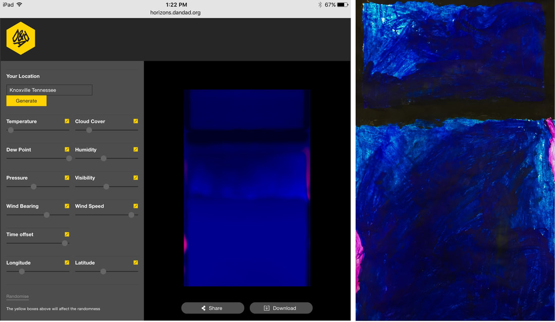  Here are a couple of links to better information about Fleur Isbell and her work- these articles do a much better job explaining the science and technology that her work involves. Colors That Connect the World Graphic Design: Rising Star Fleur Isbell  Our school is participating in an Artist Trading Card swap this year. A separate post will be coming about these "ATCs" later. These cards are small pieces of artwork that students can trade and share with their friends. To make these ATCs, students experimented with a beginning printmaking technique using markers and styrofoam. The goal of the project was to make multiple copies, or "prints" of their design. The first step was for students to create their surface to be printed, called a printing plate. They used a ballpoint pen to press indentations into the styrofoam. Their designs had to involve patterns in some way. In Art, we define patterns as shapes or lines that repeat. Patterns can be regular (exactly the same each time- like a checkerboard design or evenly spaced stripes) or irregular (like animal print or raindrops on glass.)   In the next step, students applied ink to the printing plate using markers. It was important for the markers to be fresh and full of ink- dried out markers would not work!   Before students inked their printing plates, they prepared their paper by laying a damp sponge over the blank card. The paper would soak up a bit of the water and become just the right dampness to allow the marker to tranfer. When the plate was fully inked, students carefully laid the damp paper over it and pressed carefully to transfer the ink.  Next is the big reveal! Students carefully pulled back the paper to see their finished print.       The best part about this printing technique is that the printing plate can be cleaned off and used again and again! Some hard-working students made as many as ten prints!    Trading and sharing these cards will be a very fun experience.   Fourth graders jumped right into this project at the start of the school year. Their work is finally finished and ready to share! The title of this project is "Meaningful Places. " I asked the students to think of a place that had meaning for them. Some students chose the country of their heritage, others chose previous homes or favorite vacation spots, and some chose places connected to special memories. For inspiration, we looked at the work of some master landscape artists of the 20th century. We noticed how these artists used bright colors and bold outlines to bring strong emphasis to the shapes in their work.  Andre Derain Charing Cross Bridge 1906  Henri Matisse Forest at Fontainebleau 1909  Maurice de Vlaminck Restaurant la Machine at Bougival 1906 Students used their iPads to find an image to use as inspiration for their work. I printed each student a copy of their image and we used them as the base for the artworks. The next step was to add color using oil pastels. Students could choose to use natural colors or to be inventive with their color choices. We explored how colors could create contrast in the image. Students also experimented with blending and layering the oil pastels to create texture and shading.     The finishing touch was to outline the shapes with black glue. This created the bold shapes like in the master works we first looked at.   Here are some of the finished artworks! They will be on display at our upcoming festival later this week. I asked each student to write a short explanation to be displayed with their artwork.  "This is my apartment that I live in. It is near our school. We have a balcony. Our apartments are tan and brown. People come and visit us. We are very happy where we are. Our neighbors are really nice. Me, my mom, and our dog live in our apartment." - Indea  "This picture is like Myrtle Beach. I chose this place because it reminds me of my aunt. It is special to me because I saved a starfish there. It reminds me of my baby cousin." - Sonya  "I picked this picture because it is located in Mexico. It is cool to be in Mexico." - Ruben  "This picture is from Texas. I chose this place because it's where I was born. It is special to me because I was born there. It reminds me of summer." - Addyson  "I chose this picture of the Charleston bridge because I used to live there. I used to drive across that bridge to go to school. My mom used to work across that bridge." - Shepherd 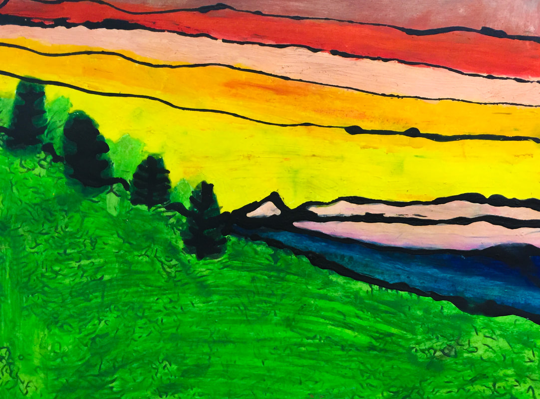 "My artwork is a sunset on the Cherokee village. I chose it because I have Cherokee in me and it is a very beautiful place. Their sunsets are very pretty and I love this place." - Chloe  "I chose this picture so people can see my home. It's special because it's where I live. It reminds me of my grandpa." - Jadyn 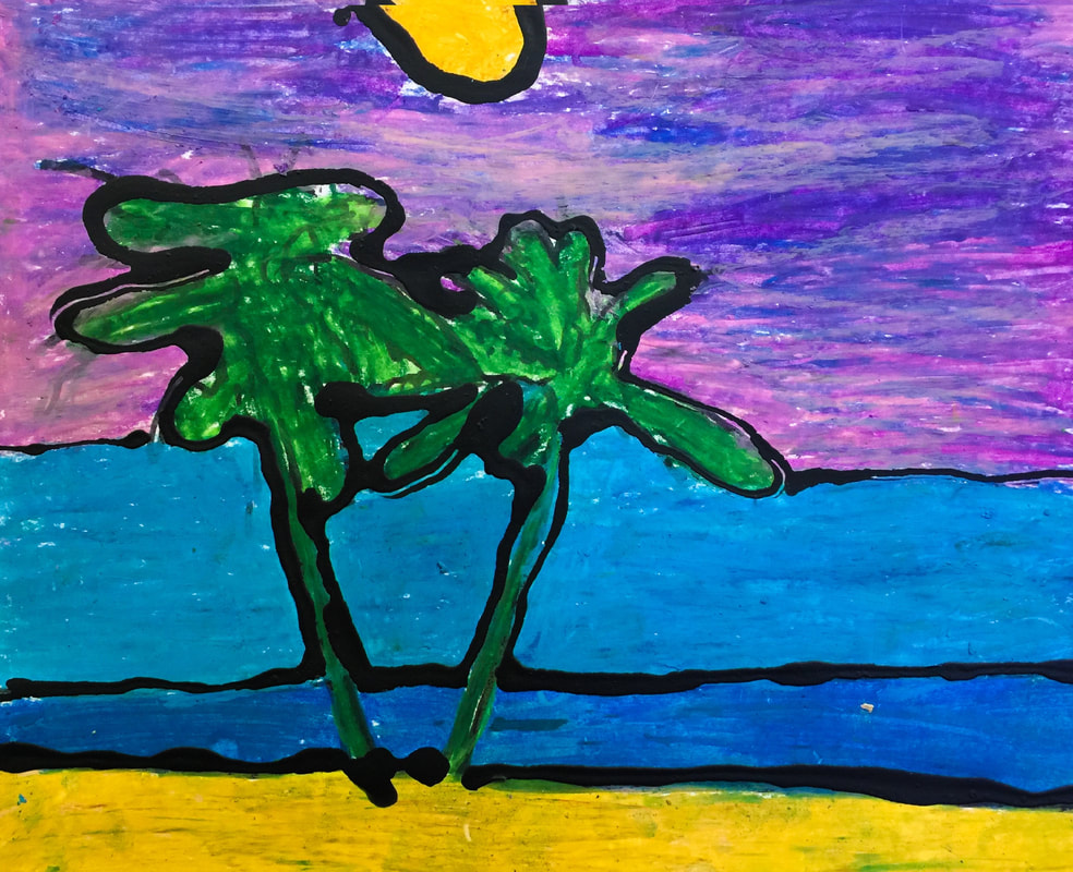 "This is a picture from Hawaii. I chose this place because it looks very pretty. It reminds me of a sunset on the ocean." - Ava 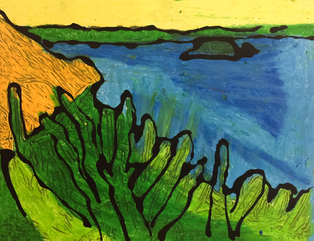 "This picture is from Mexico. I chose this place because I am going to Mexico in the summer. It is a special place because it reminds me of my grandma and grandpa. I love Mexico! " - Nelissa 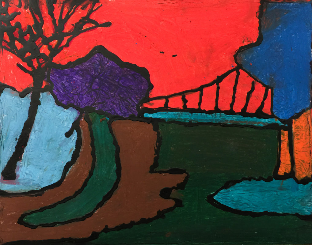 "This picture is from Greenville. I chose this place because I want to go there. It is special to me because I love adventure. It reminds me of my family." - Olga  "This is a picture of a beautiful place in Thailand." - Winston  "I chose this because it's where I'm from. It's Zimapan, Hidalgo in Mexico. I love that it's where my family is from." - Abigail  "I chose this place because I lived there. It is my apartment in Maryland. It's special to me because my brothers live there." - Carlos  "This picture is from California. I chose this place because it is a wonderful place to relax. It is special to me. It reminds me of a lake I live close to. " - Veronica  "This picture reminds me of my Grandpa because he lives in Mexico. It is sad because he will never come here to my house." - Marely 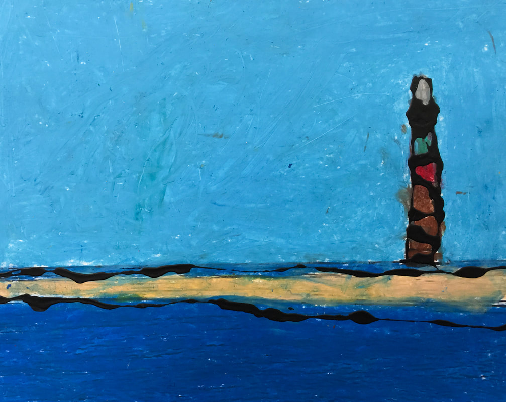 "This picture is from the beach. I got to go there last year. It was my first time to see the ocean." - Oswaldo  "I chose this picture because Mexico is where my mom was born. It is a special place because my family came from Mexico. This is special because we do some of the celebrations that Mexico does." - Moises 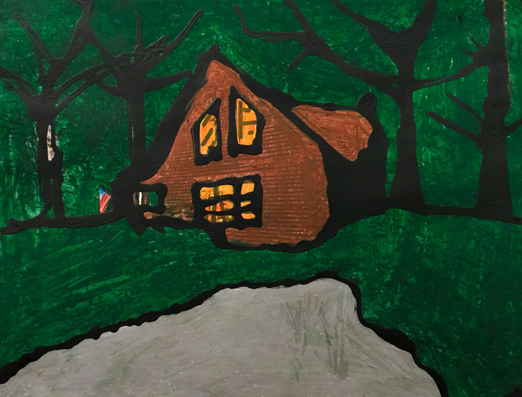 "This picture reminds me of a time that I went to a cabin with my family. I was five years old and the cabin we went to was haunted with a friendly ghost." - Shaniya  "This is a city in Mexico. I chose this because my grandma, grandpa, aunt, and mom are from Mexico." - Arisdelsy  "This is Knoxville, Tennessee. It is the capital of my home state. It reminds me of the first home I had. I've been there once. We went there when I was eight." - Grayson  "When I was little my dad would take me and my sisters to the mountains. We would sleep in a cabin and my dad and cousin would teach us survival skills and help us make breakfast on a fire. " - Jacoby  "This picture is from Cambodia. I chose this place because it is thousands of years old. It's special because my people respect the Angkor Wat." - Ardynn  "I chose this picture from Mexico because it is meaningful to me. I like the ocean and the sand and the beautiful sky." - Samuel 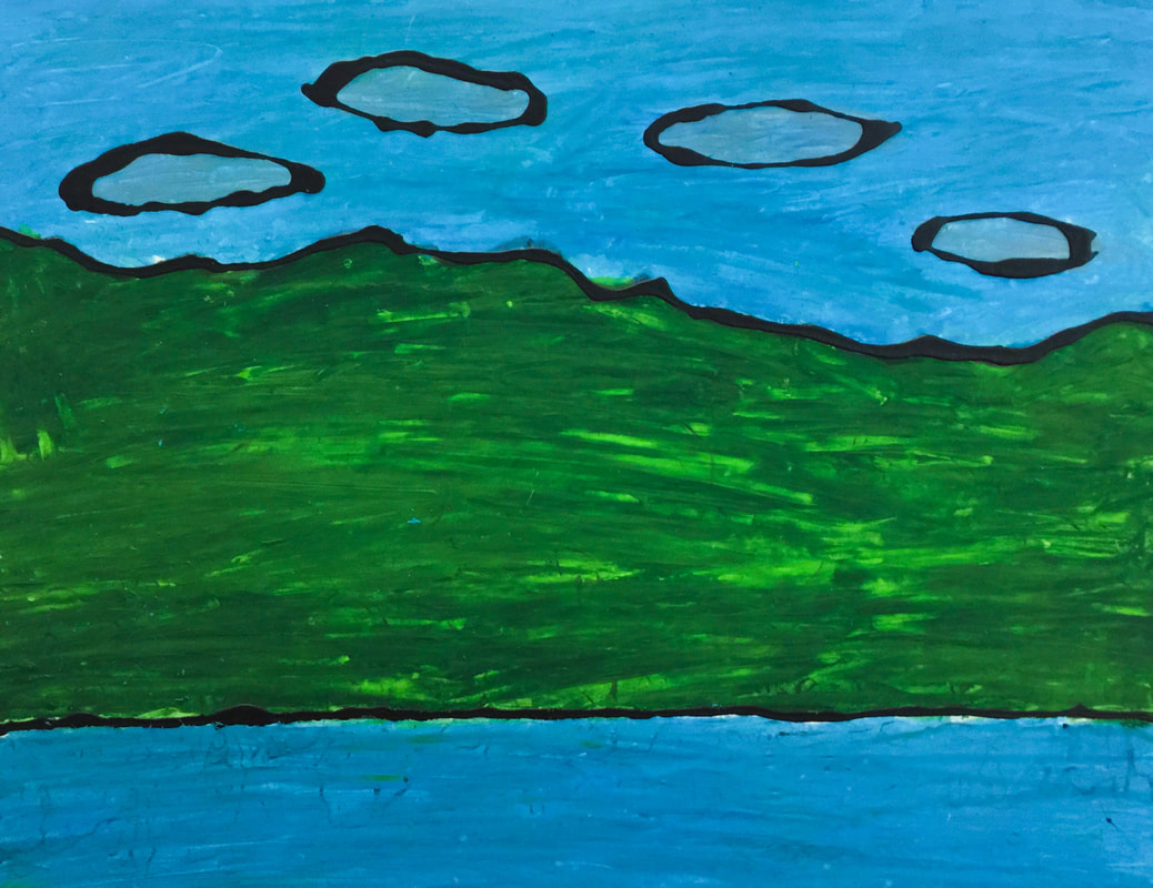 "I chose this picture because I learned that I had African in me and I didn't know. So this picture is of an African landscape with mountains." - Maranda  "The Great Smoky Mountains is a place me and my family go every year. We usually stay in a cabin and spend time together."
- Abbey  This year Hendrix participated in International Dot Day 2017. On this day each year, artists all over the world celebrate the creativity and inspiration found in Peter H. Reynolds' book The Dot.  The Dot is the story of a young artist named Vashti who thinks she can't draw. Her teacher tries to help her by saying "Just make a mark and see where it takes you!" Vashti angrily jabs her pencil into her paper, leaving a black dot behind. The next time Vashti comes to Art, she sees her black dot hanging on the wall! She says to herself "Hmmph. I can make a better dot than that!" And she does! Her teacher's encouragement and support was all Vashti needed to be successful. By the end of the story, Vashti has taken on the role of teacher, and the book ends with her helping a little boy learn to "make his mark!" The book has inspired artists all over the world, and each year in September, International Dot Day is celebrated! This year over 10 million artists in over 170 countries were part of the celebration- and our Hendrix artists were included in that number!  Hendrix artists celebrated by making their own dot-inspired artworks. These paintings will be on display at our school during the month of September. I am looking forward to this being a new tradition for our school!              After we finished our paintings, students loved hearing this message of inspiration from The Dot author Peter H. Reynolds! It was almost like getting to meet him ourselves! We are already excited to celebrate International Dot Day 2018!  I wanted to take a minute to explain the behavior expectations for when your children are in the Art room. I always express to students that the Art room is a shared space, and about 700 students use it each week. This means we have to make good use of the limited time we have together and make each class period as productive as possible, as well as take good care of our materials and equipment so everything will be ready for the next group of kids! Each classroom in our school begins the year by developing a list of expectations called an "Essential Agreement." This is IB terminology for behaviors each member of our class agrees are necessary for a functional and pleasant place to learn. I ask each student to sign their name to our Art Room Essential Agreement. This signature creates a contract between each student and the other members of the class. I explain to the students that it's like making a promise. When misbehaviors occur, I can remind each student of the promise he or she made to follow our expectations.  In each class session, I select one student to honor for doing a particularly good job. Their reward is a cupcake sticker. Let me explain what cupcakes have to do with making art! It's all based on this rubric:  I explain to students that making Art is like decorating cupcakes. Sometimes students turn in work that is like the first cupcake on this poster- it's not even finished. The next category is what we call the "sloppy cupcake". The student made minimal effort and did not take pride in their work. I describe the third cupcake as being "fine". It's finished, all the requirements have been met, but it's nothing special. This represents artwork that's good, but not great. The final category on the rubric is our "fancy cupcake." THIS represents the kind of work I'm looking for- work that goes above and beyond expectations! This quality of work is what I reward with a matching cupcake sticker. So if you see your child bring home a sticker like this, understand that it represents a job very well done! It's important that children understand that this reward is NOT based on talent or skill, it's earned through EFFORT. All students, even those who struggle with Art and may not have a lot of natural talent, will earn a cupcake sticker at least once each year. I make sure that every student in the class is honored one time before any student earns a second sticker. As you may know, Hendrix participates in the Positive Behavioral Interventions and Supports program. The "PBIS" philosophy encourages good choices in our students. PBIS supports the use of a common language between all areas of a school. That common language is evident in what we call our "PACK expectations". We ask students to be "Part of the PACK" here at school. PACK is an acronym for being principled, appreciative, cooperative, and knowledgeable. Each area of our school has a system of expectations using this vocabulary. Our PACK expectations for Special Area classes are described in this chart:  Each time students attend a Special Area class, the teacher records their behavior on this chart and returns it to the classroom teacher. This helps us all maintain high standards for our students' behavior in all areas of the school. Each Special Area teacher tracks the points earned by each homeroom class, and the classes work toward earning reward days. In Art, our reward days involve fun activities like playdough, painting with shaving cream, or drawing outside with sidewalk chalk! Occasionally students fail to follow the expected behaviors in the Art room. When that happens, students first receive a warning. I keep cards with a stop sign picture on them, and if a student is making a bad choice (such as talking when they're not supposed to, or mistreating supplies, or not following directions) I place a stop sign card on that student's desk. This is a visual reminder that they need to "stop what they are doing and make a better choice," as the card reads. Usually this is all it takes to get a student back on track! If the problem behavior continues, that student will lose the privilege of making Art for the remainder of the day, and will instead complete one of these "Better Choices Sheets." This form is designed to help a student think about what happened and realize why it was a problem, as well as give them a chance to explain what was going on and how the problem started. I have two versions of Better Choices Sheets- one for older students, and one for younger kids with pictures to circle instead of writing a sentence. The form has a place for me to describe to parents what happened, and asks the parent to sign the form and have their student return it to me the next day. Fortunately these Better Choices Sheets are not a common occurrence here in our Art room- students would much rather be participating in making Art!  Parents, if you ever have a question or concern about our routines or expectations in the Art room, please let me know! Our schedule has changed a great deal this year. It's been quite an adjustment for both the teachers and the students, but things are settling into place well. We are now using a rotation schedule, and we have A-week, B-week, and C-week. One benefit of the new schedule is that students in 1st-4th grades will have hour-long sessions for Art this year, increased from the 45-minute classes we had in the past. Kindergartners will have half-hour sessions, but will come to Art twice as often. It works out that in each three-week cycle of the rotation, all students will have 2 1/2 hours of Art! Each Friday, all art classes will last only 30 minutes, and each classroom will have one Friday session in each three-week cycle. Since our "Friday Sessions" are so short, we'll use these days for skill-builder exercises, rather than continuing our regular art projects. I'm excited to get to try some new activities with students! This session's activity was based on a new book I discovered over the summer, called "Swatch: the Girl Who Loved Color." Here's a preview video from the publisher- "Swatch" is an imaginative little girl who sees colors as wild, free, creatures. She tries to tame the colors and trap them in jars. She soon realizes that the colors aren't meant to be tamed, and instead should remain free. She releases the colors and they swirl together, making a masterpiece.  Swatch describes her favorite colors with wonderful figurative language. She gives colors names like "rumble-tumble pink", "bravest green", and "in-between gray." After we read the book, students were asked to name their own color and write a description of it.                This artist even drew his own interpretation of Swatch, riding the colors through the sky!  And this artist drew herself as Swatch, complete with stripes of face paint like the character in the book! At the end of the lesson, students shared their color creations with each other.   Welcome back to school! It has been a great first few weeks. Very busy, but great! We started the year with a solar eclipse-themed artwork, to celebrate the "Great American Eclipse" that passed over us on August 21st. We started by looking at some artworks inspired by previous eclipses. We discussed how each artist interpreted the eclipse in a unique way and with a variety of materials.  Representing an eclipse through a pen-and-ink drawing.  And a painting.  With stained glass.  Wood-working techniques.  And quilting! Students then created their own interpretation of the eclipse using a chalk pastel technique. Here are our "Solar Eclipse Silhouettes"!             I love the detail this student added- a drawing of himself wearing his eclipse glasses!!
Fourth grade's art show project ties in with our current focus on Japanese culture, culminating in our annual Cherry Blossom Festival. The artwork fourth graders created for the show was inspired by the work of contemporary Japanese artist Yayoi Kusama. Click here to read a summary of Kusama's life and career.  Yayoi Kusama is nicknamed the "princess of polka-dots." She uses a dot theme in almost all of her work. She is a painter, sculptor, and fashion designer.   Fourth graders had a LOT of creative freedom with this project. I told them the only requirements were that their art has to have a circle theme, and that it had to fit in the frame. Other than that, the possibilities were endless! They could choose paint, crayon, marker, oil pastel, collage, chalk, or anything else I had available.    I absolutely love how unique each of these artworks is. It's amazing how you can see each student's personality in their work!             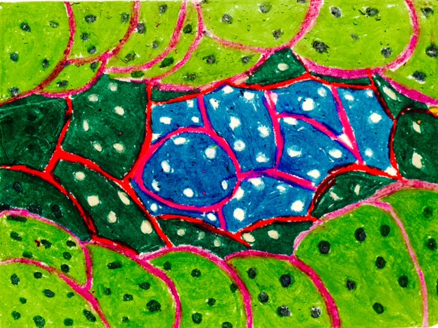    I asked students to write a short statement explaining where their ideas came from. Here are some of their thoughts: “I was inspired by Yayoi Kusama’s mix of little and big circles.” “My artwork reminds me of seeds flying through the sky.” “I was inspired by the colors and details that her pictures had. She had lines in her background so I added them to mine.” “My artwork reminds me of cinnamon rolls because one of my circles looks like a cinnamon roll twist.” “I was inspired by the bright colors in her paintings. My artwork reminds me of the bright colors I see in Mexico.” “My art reminds me of a paintball gun shooting the wall.” “I was inspired by cartoons, and my artwork reminds me of the animals from Put Me in the Zoo by Dr. Seuss.” “My artwork reminds me of all the ice cream flavors at the shop.” “I think this piece of art would match the song Raindrops Falling on My Head!” “My artwork reminds me of planets in the galaxy.” “What inspired my art was doughnuts with sprinkles.” “My artwork reminds me of when springtime flowers pop up and bloom.” “I was inspired by a paint tray with all the colorful circles on it.” |
Archives
March 2018
Categories
All
|
 RSS Feed
