|
The weather lately has been beautiful and spring-like! It has made it seem like winter is really over, even though the forecast calls for cold weather again soon. But to celebrate the nearness of Spring, and to tie in with Black History Month during February, we made paintings inspired by artist Alma Woodsey Thomas.  Alma Thomas got her inspiration from the natural world. She was born in Georgia, but spent most of her life in Washington, D.C., where she worked as an art teacher. She missed the green grass, sunshine, and trees, but could look out the window of her apartment and enjoy the garden planted below. The natural world was the inspiration for most of her paintings. Her painting style was unique. She built shape and form out of small dabs of paint, almost like puzzle pieces that fit together to make the image. Her works are abstract- meaning they don't look realistic. It's sometimes hard to tell what the painting is supposed to represent, but her descriptive titles help the viewer interpret her paintings. Here are some of Alma Woodsey Thomas's paintings, along with what inspired them-   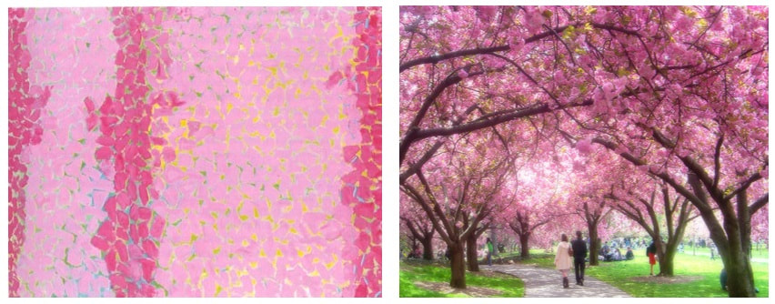     For our own art-making, I asked students to think of something in nature that inspires them- something they feel strongly about and can remember in detail. It could be a happy spring day with birds singing, or the way the air smells after the rain, or maybe a scary, loud, thunderstorm! I gave them lots of ideas, but wanted them to choose for themselves. Their task was to represent their idea using only dots and dabs of color. We used oil pastels first, then painted over it with tempera cake paint. They did a great job!     
0 Comments
To complement first grade's learning about our solar system, we made these beautiful interpretations of Vincent Van Gogh's Starry Night! One of my favorite tools to use with students is this interactive viewer. It has a function that lets you "zoom in" on paintings, and we used it to look very closely at Starry Night. We were looking for the swirly brushstrokes Van Gogh used to create the texture in his night sky. It's amazing how up-close we can get!!     I have actually seen the real Starry Night, when it was at the High Museum in Atlanta several years ago, and you certainly can't get this close to it in real life! To begin our own versions of the painting, students tried to mimic Van Gogh's swirling marks. We mixed and blended many shades of blue and white.    Next, we created the ground. We cut black construction paper and used crayon to make colorful marks that looked like the choppy textured brushstrokes Van Gogh used.  The next step really made these paintings come to life- we added the stars! We carefully observed how Van Gogh created rings around his stars using dashed lines to form concentric circles, like this:  This was my favorite part of the painting process- and the students' favorite, too! These skies are so beautiful!      For a finishing touch, we used colored paper to create a village below the starry sky.    Here are the finished landscapes!      As Van Gogh once said, "Looking at the stars always makes me dream..." To end the lesson on a fun note, we enjoyed these Starry-Night themed videos!
I developed this lesson based on a conversation with one of our kindergarten teachers a couple of years ago. We were talking about their unit on communities, and how one aspect of that unit involved learning to read and create maps. The teacher said that her students often have a hard time grasping that maps are drawn from ABOVE- instead, students tend to draw maps as scenes, with all the buildings sitting beside each other. I knew there had to be a way I could teach that concept through Art. Over the last couple of years, I have tried several different activities to teach about a "bird's eye view" and never quite found the right lesson for our kids. But this year, I think I might have found it! I am interested to hear from our kindergarten teachers if they notice an improvement in student's understanding of map-making. I had three goals for this lesson:
This was a two-part lesson. The activity for both weeks was to paint a tree. In week 1, we painted a tree from BELOW. In week 2, we painted trees from ABOVE! I wanted students to notice the differences in how the trees looked and be able to represent each view with an artwork. PART ONE: To start off week 1's lesson, I showed the students Georgia O'Keeffe's painting The Lawrence Tree. I didn't tell them what the painting was- instead, I asked them to interpret what they saw. Some kids had really creative interpretations- "an octopus!" was an answer I heard more than once! Eventually we came to the conclusion that it was a tree. By asking guiding questions like "What's unusual about this tree?" and "How does this tree look different from the one we see outside the window?" I was able to get kids to verbalize that the artist was under the tree and looking up into the night sky.  Georgia O'Keeffe The Lawrence Tree 1929 The painting experience for this part of the lesson was a lot of fun. We got to go outside and enjoy the beautiful fall weather! We sat under a tree and looked up. First we talked about some of the things we noticed- especially the shape and width of the trunk. We talked about how it looks really thick and strong at the bottom, but as you look further up into the tree, the trunk looks thinner and far away. I showed them The Lawrence Tree again, and we noticed how the trunk made the shape of a triangle. We also talked about the branches and twigs, and how they get smaller and more delicate as you look further up into the tree. Then it was time to paint! I didn't give much instruction or do any modeling of how to paint the tree; instead, I wanted students to create their own interpretation. Many of the kids really had a strong grasp of the concept, while others were not quite ready for it yet.      Next we came back inside and added some green leaves to complete our view of a tree from underneath.    We ended the day with a look at Tana Hoban's book Look Up, Look Down. It's a wordless book full of photographs that ask the viewer to decide whether we are looking UP or looking DOWN at the image. It was the perfect transition into next week's lesson!      PART TWO: In the second lesson of this unit, we looked at trees from ABOVE! First I asked students to summarize what we did the previous week. Then I told the that this week we would be looking at the opposite view- instead of going underneath a tree, this time we were going to go UP!  I told them we were going to pretend to go up in the sky on a hot air balloon. We watched this video to see what it would be like. I asked them to be sure to notice the trees and how they looked different depending on how high the balloon was. Then I gave each student an aerial photograph, similar to the scenes we saw in the video. I asked them to paint what they saw- focusing on realistic shapes and details. We talked about how the trees looked- why didn't we see any of the trunks? Then each student began working on their painting, representing the photo to the best of their ability.     As in the previous painting activity, some students had a clear understanding and it was evident in their work. Several students weren't quite ready to grasp this concept, and we will revisit it again. I am hoping that with some more intensive instruction from their teachers in the upcoming unit, that it will finally "click" for them! Here are some of the finished paintings, paired with the reference photo the student used.   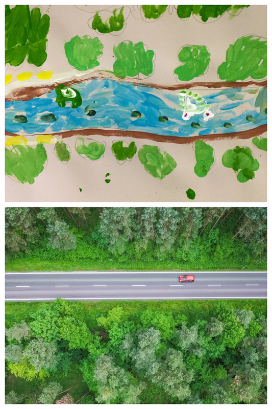  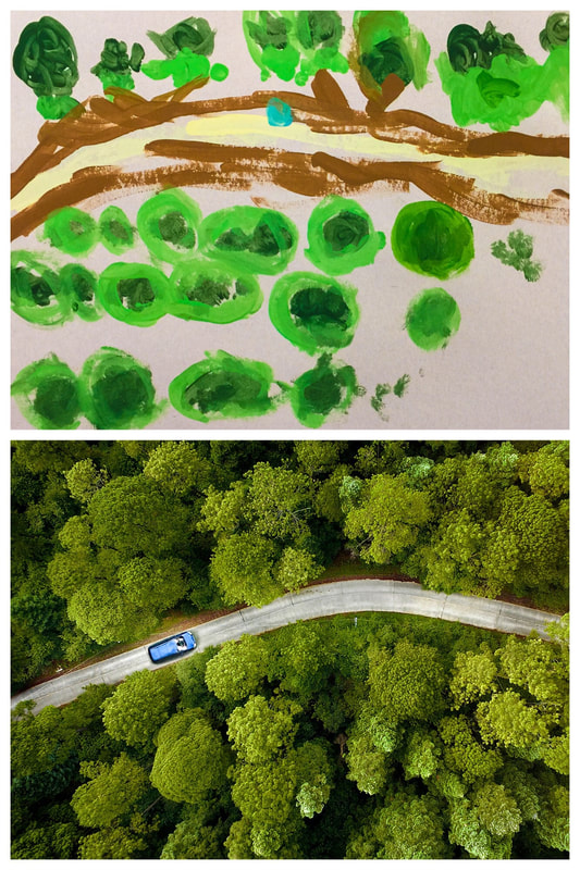 I want to share two more books I was able to use in this unit. The first is Looking Down by Steve Jenkins- one of my favorite illustrators. This wordless picture book is made of cut-paper illustrations showing our world from varying distances. Each page takes us closer and closer (or further and further, depending on whether you start at the front or the back.) For this lesson, I shared the book beginning at the back- we started with this close-up view of a ladybug. Each page takes you higher to see more and more of the picture. The scenes where you can see the whole neighborhood were helpful when I talked about maps with the students.                Below is a link to a video read-aloud of the last book I shared. This is They All Saw a Cat by Brenden Wenzel. This book was recommended to me by another art teacher. It's a great visual representation of perspective- how we each see things from a unique point-of-view. Fourth graders jumped right into this project at the start of the school year. Their work is finally finished and ready to share! The title of this project is "Meaningful Places. " I asked the students to think of a place that had meaning for them. Some students chose the country of their heritage, others chose previous homes or favorite vacation spots, and some chose places connected to special memories. For inspiration, we looked at the work of some master landscape artists of the 20th century. We noticed how these artists used bright colors and bold outlines to bring strong emphasis to the shapes in their work.  Andre Derain Charing Cross Bridge 1906  Henri Matisse Forest at Fontainebleau 1909  Maurice de Vlaminck Restaurant la Machine at Bougival 1906 Students used their iPads to find an image to use as inspiration for their work. I printed each student a copy of their image and we used them as the base for the artworks. The next step was to add color using oil pastels. Students could choose to use natural colors or to be inventive with their color choices. We explored how colors could create contrast in the image. Students also experimented with blending and layering the oil pastels to create texture and shading.     The finishing touch was to outline the shapes with black glue. This created the bold shapes like in the master works we first looked at.   Here are some of the finished artworks! They will be on display at our upcoming festival later this week. I asked each student to write a short explanation to be displayed with their artwork.  "This is my apartment that I live in. It is near our school. We have a balcony. Our apartments are tan and brown. People come and visit us. We are very happy where we are. Our neighbors are really nice. Me, my mom, and our dog live in our apartment." - Indea  "This picture is like Myrtle Beach. I chose this place because it reminds me of my aunt. It is special to me because I saved a starfish there. It reminds me of my baby cousin." - Sonya  "I picked this picture because it is located in Mexico. It is cool to be in Mexico." - Ruben  "This picture is from Texas. I chose this place because it's where I was born. It is special to me because I was born there. It reminds me of summer." - Addyson  "I chose this picture of the Charleston bridge because I used to live there. I used to drive across that bridge to go to school. My mom used to work across that bridge." - Shepherd 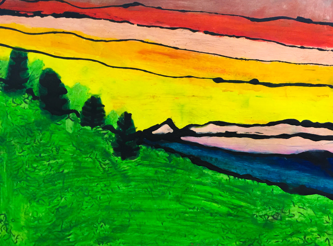 "My artwork is a sunset on the Cherokee village. I chose it because I have Cherokee in me and it is a very beautiful place. Their sunsets are very pretty and I love this place." - Chloe  "I chose this picture so people can see my home. It's special because it's where I live. It reminds me of my grandpa." - Jadyn 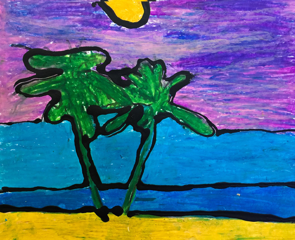 "This is a picture from Hawaii. I chose this place because it looks very pretty. It reminds me of a sunset on the ocean." - Ava 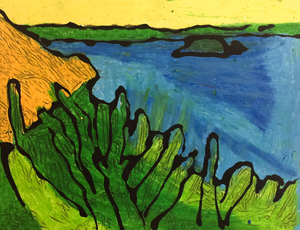 "This picture is from Mexico. I chose this place because I am going to Mexico in the summer. It is a special place because it reminds me of my grandma and grandpa. I love Mexico! " - Nelissa 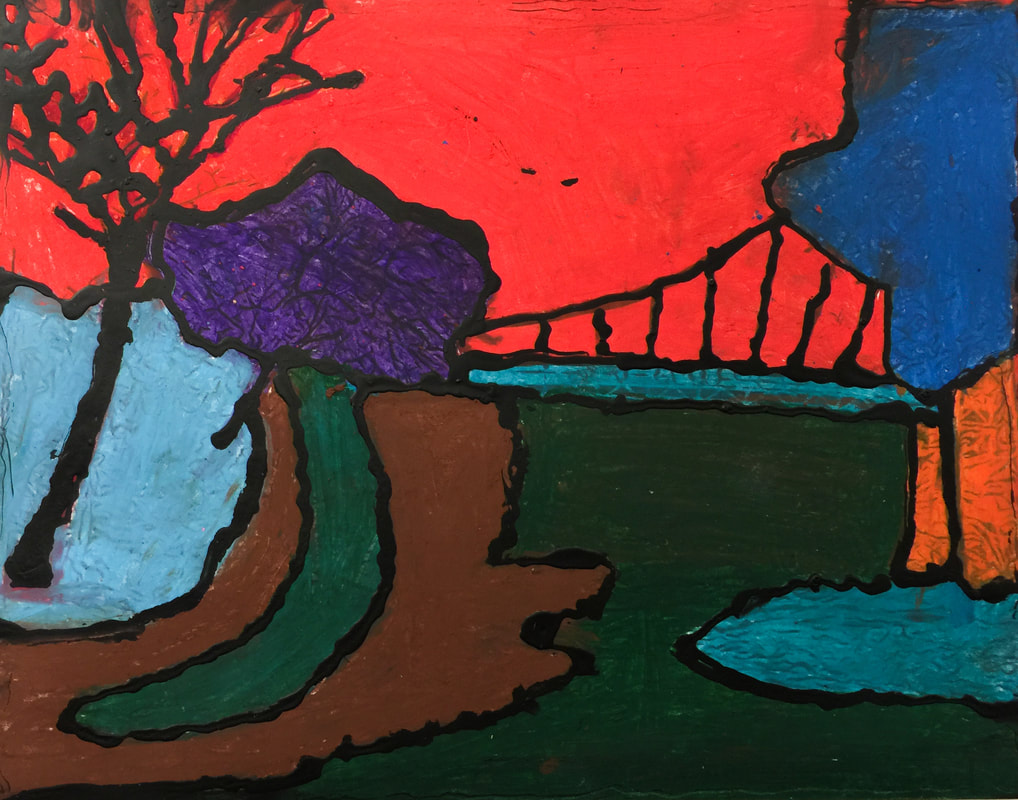 "This picture is from Greenville. I chose this place because I want to go there. It is special to me because I love adventure. It reminds me of my family." - Olga  "This is a picture of a beautiful place in Thailand." - Winston  "I chose this because it's where I'm from. It's Zimapan, Hidalgo in Mexico. I love that it's where my family is from." - Abigail  "I chose this place because I lived there. It is my apartment in Maryland. It's special to me because my brothers live there." - Carlos  "This picture is from California. I chose this place because it is a wonderful place to relax. It is special to me. It reminds me of a lake I live close to. " - Veronica  "This picture reminds me of my Grandpa because he lives in Mexico. It is sad because he will never come here to my house." - Marely 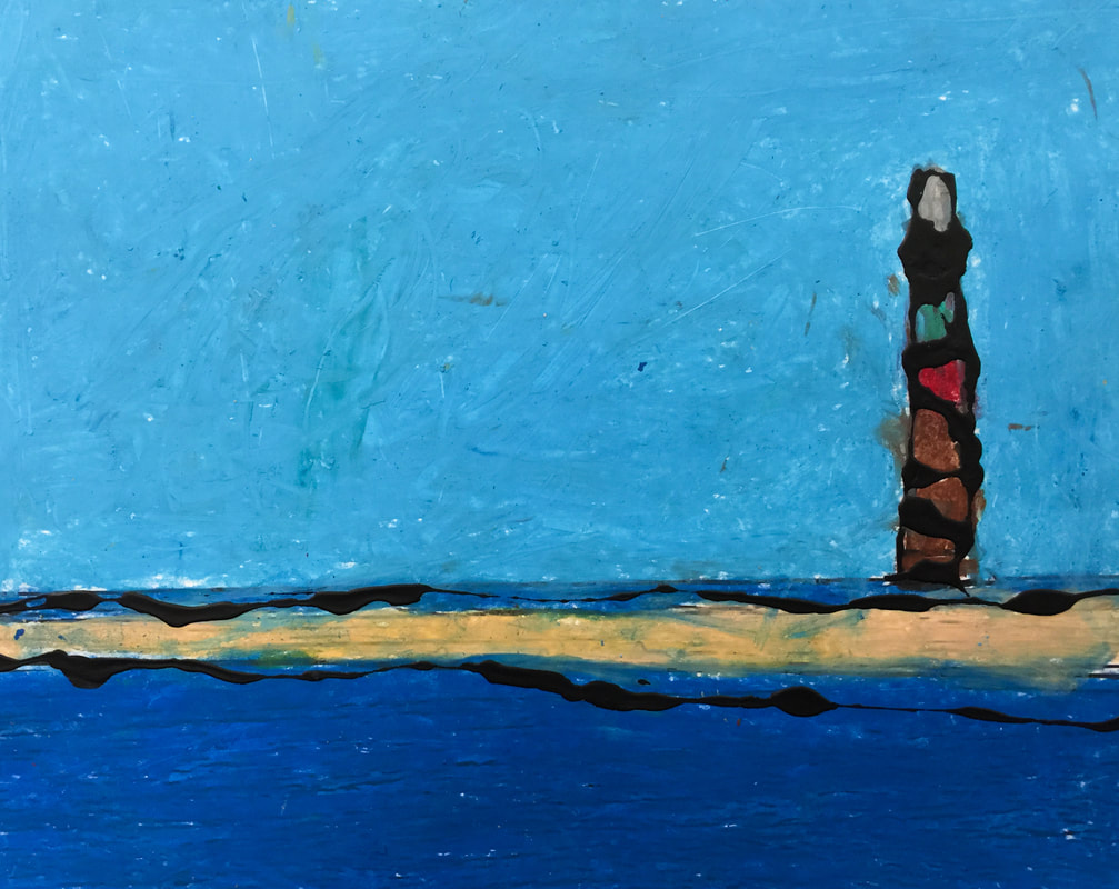 "This picture is from the beach. I got to go there last year. It was my first time to see the ocean." - Oswaldo  "I chose this picture because Mexico is where my mom was born. It is a special place because my family came from Mexico. This is special because we do some of the celebrations that Mexico does." - Moises 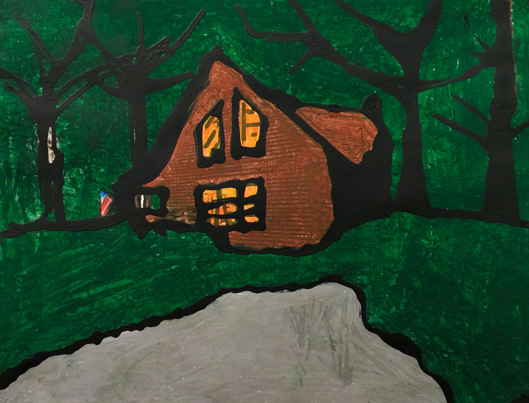 "This picture reminds me of a time that I went to a cabin with my family. I was five years old and the cabin we went to was haunted with a friendly ghost." - Shaniya  "This is a city in Mexico. I chose this because my grandma, grandpa, aunt, and mom are from Mexico." - Arisdelsy  "This is Knoxville, Tennessee. It is the capital of my home state. It reminds me of the first home I had. I've been there once. We went there when I was eight." - Grayson  "When I was little my dad would take me and my sisters to the mountains. We would sleep in a cabin and my dad and cousin would teach us survival skills and help us make breakfast on a fire. " - Jacoby  "This picture is from Cambodia. I chose this place because it is thousands of years old. It's special because my people respect the Angkor Wat." - Ardynn  "I chose this picture from Mexico because it is meaningful to me. I like the ocean and the sand and the beautiful sky." - Samuel 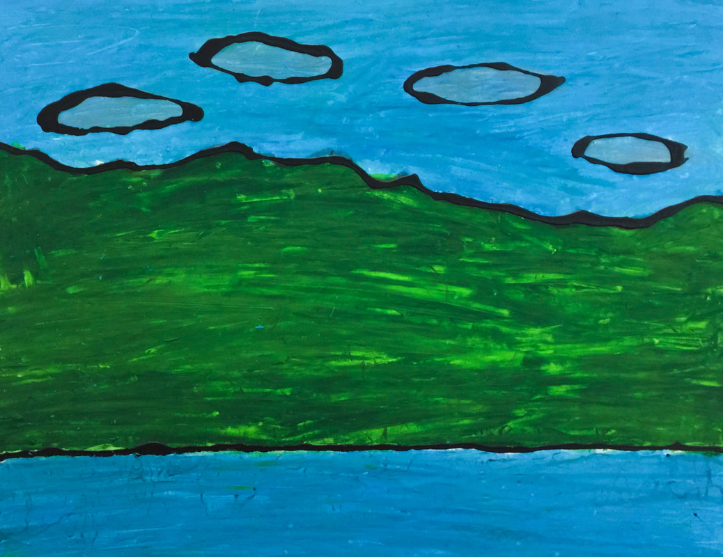 "I chose this picture because I learned that I had African in me and I didn't know. So this picture is of an African landscape with mountains." - Maranda  "The Great Smoky Mountains is a place me and my family go every year. We usually stay in a cabin and spend time together."
- Abbey  Welcome back to school! It has been a great first few weeks. Very busy, but great! We started the year with a solar eclipse-themed artwork, to celebrate the "Great American Eclipse" that passed over us on August 21st. We started by looking at some artworks inspired by previous eclipses. We discussed how each artist interpreted the eclipse in a unique way and with a variety of materials.  Representing an eclipse through a pen-and-ink drawing.  And a painting.  With stained glass.  Wood-working techniques.  And quilting! Students then created their own interpretation of the eclipse using a chalk pastel technique. Here are our "Solar Eclipse Silhouettes"!             I love the detail this student added- a drawing of himself wearing his eclipse glasses!!
This lesson was a special request from one of our first-grade teachers. The northern lights are a phenomenon visible in any of the world's northern-most areas, but our focus for the week was on Alaska. The science behind the northern lights is way too advanced for first graders to grasp- we just learned that the lights are created because how the earth's atmosphere reacts to the sun's atmosphere.  We started with this fascinating video of the northern lights (the footage is actually from Scotland rather than Alaska, but it was a beautiful example!) To make our own version of the northern lights, students used colored chalk. They colored the torn edges of some scrap paper, then used a paper towel to blend the chalk dust into the background. The final step was to paint tree silhouettes and add sparkling stars to the sky!        One of the things I enjoy about teaching Art is that I get to support students' academic learning by integrating those concepts with opportunities for them to explore and create. This second-grade project is a good example of this integration. Students created a landscape of their choosing and used math concepts to guide their drawings. Each student received this checklist-  The kids could draw anything their imaginations could come up with- any kind of tree, any kind of building, any kind of weather... as long as they could answer these questions about their drawings. I was pleased to see some really creative ideas! We only worked on these drawings for two weeks, which was not really enough time to get them as finished as they could be. The kids will keep their work in their folders and can pull it out when they have a few free minutes.          Fourth grade artists took a trip back in time to experience how art-making would have been in the early years of our nation! They designed a house in the colonial architectural style and drew it using materials similar to what would have been used back then- a quill pen made from a feather!  The main characteristics of a colonial house are:
 We watched this video, which took us on a tour of a historic home in Philadelphia. Built in the 1750's, the Woodford Mansion is now a museum dedicated to preserving and showcasing life in the past. Students used a quill pen made from a real feather to make these drawings. They decided they were very grateful to live in a time when pencils and erasers are available- it was hard not being able to erase mistakes!    And here are some of the finished products!         To make the drawings look authentically aged, some students crumpled the edges and added stains. This step was optional- after working so hard on these drawings, some just couldn't stand to crumple them up! I hope this experience was memorable for students, and that it helped them be able to picture life in colonial America!    Second grade is in the middle of a unit about weather. Part of their instruction involves identifying types of clouds- cumulus, cirrus, and stratus. What could be a better way to learn how clouds look than to go outside and observe them? So we took our painting supplies and headed outside to observe and paint. Fortunately, the weather cooperated for most classes! A couple of classes did not get to go outside yet, but they will have a turn in the coming weeks.     Here are some finished paintings!  First Grade's Art Show was a huge success! I have been so looking forward to sharing their work. We spent about six weeks on these projects (about twice as long a a typical project) and that hard work really paid off! Our inspiration came from the lyrics of the song "America the Beautiful", which was featured in the musical students performed the same night as the Art Show. The theme of patriotism goes along well with first grade's current IB unit. Our paintings portrayed our country's "spacious skies", and "amber waves of grain", and "purple mountain majesties." I think these artworks are absolutely gorgeous! It's one of our most successful projects yet!          |
Archives
March 2018
Categories
All
|


 RSS Feed
