|
To complement first grade's learning about our solar system, we made these beautiful interpretations of Vincent Van Gogh's Starry Night! One of my favorite tools to use with students is this interactive viewer. It has a function that lets you "zoom in" on paintings, and we used it to look very closely at Starry Night. We were looking for the swirly brushstrokes Van Gogh used to create the texture in his night sky. It's amazing how up-close we can get!!     I have actually seen the real Starry Night, when it was at the High Museum in Atlanta several years ago, and you certainly can't get this close to it in real life! To begin our own versions of the painting, students tried to mimic Van Gogh's swirling marks. We mixed and blended many shades of blue and white.    Next, we created the ground. We cut black construction paper and used crayon to make colorful marks that looked like the choppy textured brushstrokes Van Gogh used.  The next step really made these paintings come to life- we added the stars! We carefully observed how Van Gogh created rings around his stars using dashed lines to form concentric circles, like this:  This was my favorite part of the painting process- and the students' favorite, too! These skies are so beautiful!      For a finishing touch, we used colored paper to create a village below the starry sky.    Here are the finished landscapes!      As Van Gogh once said, "Looking at the stars always makes me dream..." To end the lesson on a fun note, we enjoyed these Starry-Night themed videos!
0 Comments
 This is a really special project that I love doing with our kids. It's a great way for students to connect to their heritage and learn more about themselves and their family history. It's a great connection to second grade's current IB unit, which focuses on relationships, communities, and culture. Here are our "Heritage Self-Portraits":               My kindergarten kids just finished these collaborative collage projects featuring communities. In years past when I've done this project, I made sure to model everything for them- how to create a road, how to put windows on a house, how to cut shapes for a tree, etc. This year I didn't do any of that- instead, students created everything completely independently! The end products don't look as polished, but I think the learning was much greater. I did give them some thin black strips to make roads, and I pre-cut some paper into building-sized squares. I also showed them how to cut the squares diagonally to make triangles for roofs. Everything else is all theirs! Students worked in teams of three to create these communities. They started by gluing down the roads, and then from there, they could add anything they wanted! I did display some photographs of things that could be found in communities- like buildings, playgrounds, stop lights, trees, and cars- just to give them somewhere to start.  If someone had walked in the art room in the middle of all of this, they would have thought it was complete chaos! It was really noisy, kids were constantly moving around the room to get supplies from different stations, and there were definitely disagreements among team members about the best way to do things- not to mention the thousands of scraps of paper scattered on the floor. But- if you looked a little closer, you saw lots of great things happening, too:
                  I need to explain my system for distributing glue. We use "glue sponges"- a damp kitchen sponge cut in half, with a puddle of white liquid glue in the middle. Kids use one finger to scoop up a bit of glue and spread it on the back of their paper, then they clean their finger off with the damp sides of the sponge. When kids need a refill, they can help themselves with this glue dispenser. It's just a liquid soap bottle that's been filled with white glue. I tell kids they can get three pumps at a time. Sometimes they have to get help from a friend, like in the above photo- it's hard to be coordinated enough to manage both holding the sponge and pushing the top when you're only five years old! Here are just a few of the finished collages. The kids kept referring to them as their "maps", even though I never used that word with them. That just goes to show how they are connecting their learning in the classroom to what we are doing in Art!        A few years ago I discovered the work of artist Fleur Isbell. I wanted to teach a lesson inspired by her work, but the timing never worked out. Until this year!  Fleur Isbell is a contemporary designer who recently did a series of work inspired by global weather patterns. She uses technology to generate images using coded data about weather conditions in places all over the world. The images take their color and shape from information about that location's typical temperature, precipitation, cloud cover, wind speed and direction, as well as the longitude and latitude of the location. Here are some of her images:  She created an app based on this work, and the user can manipulate the way the data is generated to change the image. Its very complicated to explain, so here's where you can go to try it for yourself! As you can see if you open the site, you can type in any location and generate an image based on data about that location's weather. By sliding the circles under each category, you can increase or decrease the effect of that data and create many different images!  For this lesson, I wanted students to experience how traditional art and technology can come together. They used their iPads to create digital images using the Global Pattern Generator app, and then used that image as the basis for a painting. Through making the painting, they had to observe closely to accurately replicate the shape and proportion of each color, as well as practice mixing and blending colors to create the correct hue.   (I promise, we were careful with the iPads near the paint!!)   Overall this lesson was a success and a lot of fun, but I am going to make some tweaks if we repeat it with next year's fourth graders! I think there are a lot more opportunities for learning with this project. Here are a few of my kids' paintings along with the digital image that inspired each. Look closely to see the location each student chose- there is quite a variety!     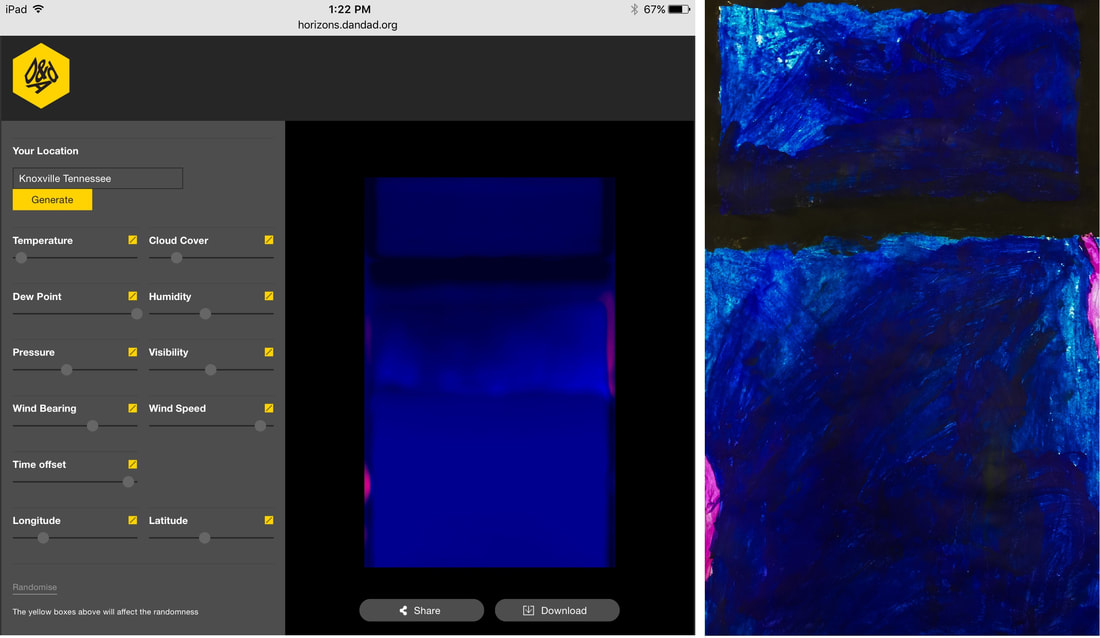  Here are a couple of links to better information about Fleur Isbell and her work- these articles do a much better job explaining the science and technology that her work involves. Colors That Connect the World Graphic Design: Rising Star Fleur Isbell This was a quick and fun project for my Gifted Art kids. The first step of the project involved them painting marks inspired by prompts I called out to them. The prompts were purposefully vague... to give an example, one prompt was "draw five circles." But I didn't specify how big the circles had to be, or if they all had to be the same size, or if they could overlap, or if they could be painted in solid! When students asked those clarifying questions, all I did was repeat the prompt. I did it this way to force the kids to make those decisions for themselves. I wanted the kids to understand that in this particular painting there really wasn't a way to do it "wrong" and that any of the marks they chose to make would be fine! This particular group of students is often very hard on themselves and very afraid to make mistakes. I chose this painting method to encourage them to let go of some of that fear and build their confidence in their own artistic decisions. After completing the mark-making with black paint, students chose a few colors of liquid watercolor to paint the remaining areas of the paper.   The next step was to cut the paintings apart! I told my kids at the beginning that we would eventually be cutting their paintings into pieces, so they needed to not get too attached to their work. This was hard for some of them!  The final step was to rearrange the painted squares into an interesting composition. Then we glued the squares on black paper, leaving a little space between the squares.   These "reassembled paintings" turned out very successfully!       Our school is participating in an Artist Trading Card swap this year. A separate post will be coming about these "ATCs" later. These cards are small pieces of artwork that students can trade and share with their friends. To make these ATCs, students experimented with a beginning printmaking technique using markers and styrofoam. The goal of the project was to make multiple copies, or "prints" of their design. The first step was for students to create their surface to be printed, called a printing plate. They used a ballpoint pen to press indentations into the styrofoam. Their designs had to involve patterns in some way. In Art, we define patterns as shapes or lines that repeat. Patterns can be regular (exactly the same each time- like a checkerboard design or evenly spaced stripes) or irregular (like animal print or raindrops on glass.)   In the next step, students applied ink to the printing plate using markers. It was important for the markers to be fresh and full of ink- dried out markers would not work!   Before students inked their printing plates, they prepared their paper by laying a damp sponge over the blank card. The paper would soak up a bit of the water and become just the right dampness to allow the marker to tranfer. When the plate was fully inked, students carefully laid the damp paper over it and pressed carefully to transfer the ink.  Next is the big reveal! Students carefully pulled back the paper to see their finished print.       The best part about this printing technique is that the printing plate can be cleaned off and used again and again! Some hard-working students made as many as ten prints!    Trading and sharing these cards will be a very fun experience.  
I developed this lesson based on a conversation with one of our kindergarten teachers a couple of years ago. We were talking about their unit on communities, and how one aspect of that unit involved learning to read and create maps. The teacher said that her students often have a hard time grasping that maps are drawn from ABOVE- instead, students tend to draw maps as scenes, with all the buildings sitting beside each other. I knew there had to be a way I could teach that concept through Art. Over the last couple of years, I have tried several different activities to teach about a "bird's eye view" and never quite found the right lesson for our kids. But this year, I think I might have found it! I am interested to hear from our kindergarten teachers if they notice an improvement in student's understanding of map-making. I had three goals for this lesson:
This was a two-part lesson. The activity for both weeks was to paint a tree. In week 1, we painted a tree from BELOW. In week 2, we painted trees from ABOVE! I wanted students to notice the differences in how the trees looked and be able to represent each view with an artwork. PART ONE: To start off week 1's lesson, I showed the students Georgia O'Keeffe's painting The Lawrence Tree. I didn't tell them what the painting was- instead, I asked them to interpret what they saw. Some kids had really creative interpretations- "an octopus!" was an answer I heard more than once! Eventually we came to the conclusion that it was a tree. By asking guiding questions like "What's unusual about this tree?" and "How does this tree look different from the one we see outside the window?" I was able to get kids to verbalize that the artist was under the tree and looking up into the night sky.  Georgia O'Keeffe The Lawrence Tree 1929 The painting experience for this part of the lesson was a lot of fun. We got to go outside and enjoy the beautiful fall weather! We sat under a tree and looked up. First we talked about some of the things we noticed- especially the shape and width of the trunk. We talked about how it looks really thick and strong at the bottom, but as you look further up into the tree, the trunk looks thinner and far away. I showed them The Lawrence Tree again, and we noticed how the trunk made the shape of a triangle. We also talked about the branches and twigs, and how they get smaller and more delicate as you look further up into the tree. Then it was time to paint! I didn't give much instruction or do any modeling of how to paint the tree; instead, I wanted students to create their own interpretation. Many of the kids really had a strong grasp of the concept, while others were not quite ready for it yet.      Next we came back inside and added some green leaves to complete our view of a tree from underneath.    We ended the day with a look at Tana Hoban's book Look Up, Look Down. It's a wordless book full of photographs that ask the viewer to decide whether we are looking UP or looking DOWN at the image. It was the perfect transition into next week's lesson!      PART TWO: In the second lesson of this unit, we looked at trees from ABOVE! First I asked students to summarize what we did the previous week. Then I told the that this week we would be looking at the opposite view- instead of going underneath a tree, this time we were going to go UP!  I told them we were going to pretend to go up in the sky on a hot air balloon. We watched this video to see what it would be like. I asked them to be sure to notice the trees and how they looked different depending on how high the balloon was. Then I gave each student an aerial photograph, similar to the scenes we saw in the video. I asked them to paint what they saw- focusing on realistic shapes and details. We talked about how the trees looked- why didn't we see any of the trunks? Then each student began working on their painting, representing the photo to the best of their ability.     As in the previous painting activity, some students had a clear understanding and it was evident in their work. Several students weren't quite ready to grasp this concept, and we will revisit it again. I am hoping that with some more intensive instruction from their teachers in the upcoming unit, that it will finally "click" for them! Here are some of the finished paintings, paired with the reference photo the student used.   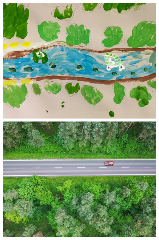  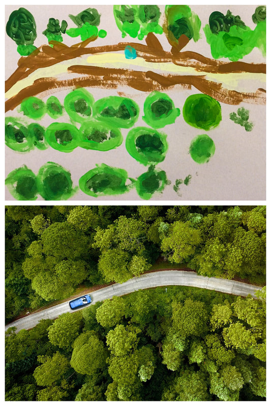 I want to share two more books I was able to use in this unit. The first is Looking Down by Steve Jenkins- one of my favorite illustrators. This wordless picture book is made of cut-paper illustrations showing our world from varying distances. Each page takes us closer and closer (or further and further, depending on whether you start at the front or the back.) For this lesson, I shared the book beginning at the back- we started with this close-up view of a ladybug. Each page takes you higher to see more and more of the picture. The scenes where you can see the whole neighborhood were helpful when I talked about maps with the students.                Below is a link to a video read-aloud of the last book I shared. This is They All Saw a Cat by Brenden Wenzel. This book was recommended to me by another art teacher. It's a great visual representation of perspective- how we each see things from a unique point-of-view. |
Archives
March 2018
Categories
All
|


 RSS Feed
