|
The school year is winding down, and it's the time of year when we can do some "just-for-fun" projects. Art Club's latest work definitely falls into that category! In our next-to-the-last meeting, I showed my kids how to marble paper using shaving cream and liquid paint. Our original inspiration for this project came from the Japanese craft of suminagashi- a method of marbling paper using water and special inks. The craft dates back thousands of years, and the name means "floating ink". Students loved looking at examples of the intricate designs. We even found a video demonstrating the process!  examples of traditional suminagashi Here's the method we used: Each student spread a layer of shaving cream in a tray. It's important to use the foamy white shaving cream, not the gel kind. We used plastic cards to scrape and smooth the surface, just like spreading frosting on a cake.  Next we dripped liquid watercolor paint onto the surface. If you want to do this at home, food coloring would make a good substitute.   We used the end of a paintbrush to carefully swirl the colors, being sure to keep the color on the surface instead of mixing it all the way through the shaving cream.  Next, carefully lay a sheet of paper on top of the design. Lightly tap your fingers over the surface to be sure no air bubbles are trapped inside. Give the paper a few seconds to soak up the paint.  Then grab a corner of the paper and pull it back. Some of the shaving cream will stick to the paper, and it will look like a foamy mess, but that's okay!  The final step is to use a plastic card to scrape away the leftover foam. Then the design will show through!  You can use the same tray of shaving cream multiple times, until it starts to look dirty. Just use the plastic card to smooth the surface between prints. The papers will dry in a few minutes, and can then be used for all sorts of art projects! Beautiful cards, gift tags, origami designs... anything you can think of!  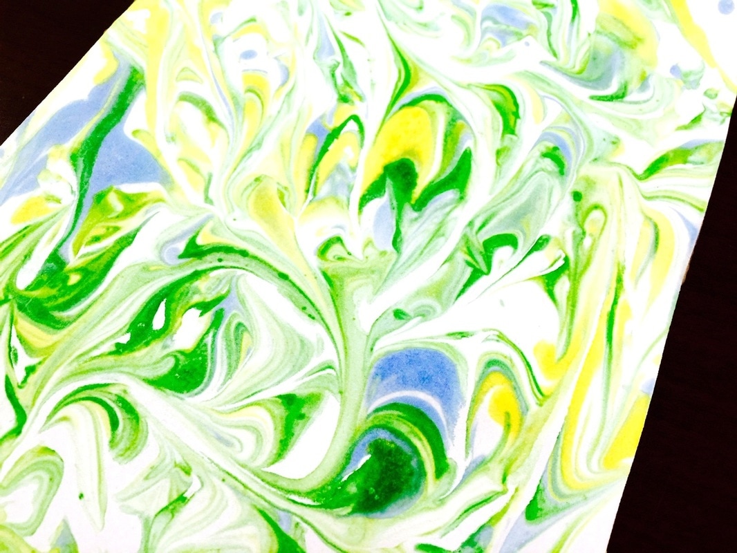   
0 Comments
 These beautifully painted flower vases were inspired by contemporary artist Heather Galler. Her use of color and pattern is so playful and bright. Her work takes an ordinary subject and turns it into something really special! As one of my kids said, "She made us look at these flowers in a whole new way!" This was our inspiration-  Visit Ms. Galler at this website to see more. Prints of her artwork are available- I just purchased a couple for our art room! Our goal in creating these paintings was to explore pattern. We started by creating the background with construction paper and liquid tempera paint. Students could create any design they wanted! I encouraged them to pay attention to their color choices- did they want their patterns to stand out or blend in?    Our next step was to create the flowers. We did these on squares of construction paper, which were then cut out and glued to the background.     Then we added leaves, and some students chose to embellish their work even more using oil pastels. The finishing touch was to outline the shapes with a line of black paint, just to help everything stand out more. I am THRILLED with how these paintings turned out! Every single day I am amazed by what our kids can accomplish- it makes my time with them so worthwhile!           This was a brand-new lesson I developed for kindergarten. It's similar to content I teach to older grades, and I was unsure if kindergartners would be able to grasp the abstract thinking required. I think they did very well! This activity is meant to support K5's Symbols unit. They studied symbols in math (like addition or subtraction signs) symbols in our community (such as road signs) and even symbols in our culture, like the bald eagle and the Statue of Liberty! In Art, our objective was to explore ways that art communicates ideas without using words, just like symbols are a way of representing ideas. This is a big concept for kindergarten brains to grasp! We started by comparing these two artworks:
These two paintings have very similar content- both features musicians- but the emotion in each painting is completely opposite! In our whole-group discussion, we identified that the differences in the artworks' moods come from both the COLOR (one painting is a dull, blue, tone, which communicates sadness and despair, while the other is bright, cheerful reds and pinks) as well as the ENERGY (the guitarist's body language is sad- his head and body are drooping- but the jazz musicians are standing tall and looking up! You can almost see them dancing!) We looked a little further into the idea of energy as communication through this video of a dancer using her body to portray feelings. I asked to students to look at how her body moved and try to identify how she may be feeling. This next video was the students' favorite part of the lesson! They loved getting to see familiar characters, yet analyzing them in a new way! We watched each character's part of this "Inside Out" video separately. After watching the part introducing Joy, I asked the students to think about what her body was doing- dancing, jumping, and flipping! Then each student painted a line representing that feeling- their lines were dancing, jumping, and flipping too!  The next character was Sadness- we compared her entrance to Joy's. Sadness enters the screen by plodding slowly along- no jumping and flipping for her! So the students painted slow, even, lines.  Next was Anger- we watched the video to see his harsh, bold, slashing movements, and the students replicated this in the lines they painted.  The character of Disgust was really hard! Fear was tricky as well- we imagined that he was so scared he was shaking, and so the students made nervous, quivering, lines.  To finish, students chose colors they thought matched each feeling and painted the white spaces of their artwork. Most students chose yellow to represent happiness, blue to show sadness, and red for anger. The other emotions were a little more subjective!     Overall, this activity allowed for lots of critical thinking, and I'm already excited to teach it again next year! The timing of this project coincides with 3rd grade's focus on animals. When we started, classes had just visited the aquarium and got to see some interesting animals in real life! With that trip fresh in their minds, students began this drawing project. Our inspiration came from this example- it was made by a high school senior, so it really set the bar high for our 3rd graders! But I knew they could do it!  The students requested the species of animal they wanted to draw, and I found photographs for them. Then they had to make four separate drawings of that animal- one had to show the whole animal, and the others were to "zoom in" on some of that animal's characteristics. They were to especially focus on the animal's physical adaptations- camouflage patterns, scales, claws, webbed feet, etc. Here are some of the results!          This week's lesson finishes up our work with plants. See the other projects here and here! Students practiced being "scientific illustrators." These people are artists who are also scientists! Scientific illustrators are the people who draw diagrams in science textbooks, medical journals, and other informational texts. They help us understand how the world works! In today's activity, students needed to focus as much on looking as they did on drawing. I wanted them to forget every other flower drawing they had ever made, and instead, to really SEE the flower or plant that was in front of them. I wanted the students to look with fresh eyes and notice every single detail. Students chose several plants to study, and we used last week's eco-prints as our backgrounds. The drawings turned out amazing, and it's obvious that the kids were looking closely at details!         Fourth grade's art show project ties in with our current focus on Japanese culture, culminating in our annual Cherry Blossom Festival. The artwork fourth graders created for the show was inspired by the work of contemporary Japanese artist Yayoi Kusama. Click here to read a summary of Kusama's life and career.  Yayoi Kusama is nicknamed the "princess of polka-dots." She uses a dot theme in almost all of her work. She is a painter, sculptor, and fashion designer.   Fourth graders had a LOT of creative freedom with this project. I told them the only requirements were that their art has to have a circle theme, and that it had to fit in the frame. Other than that, the possibilities were endless! They could choose paint, crayon, marker, oil pastel, collage, chalk, or anything else I had available.    I absolutely love how unique each of these artworks is. It's amazing how you can see each student's personality in their work!                 I asked students to write a short statement explaining where their ideas came from. Here are some of their thoughts: “I was inspired by Yayoi Kusama’s mix of little and big circles.” “My artwork reminds me of seeds flying through the sky.” “I was inspired by the colors and details that her pictures had. She had lines in her background so I added them to mine.” “My artwork reminds me of cinnamon rolls because one of my circles looks like a cinnamon roll twist.” “I was inspired by the bright colors in her paintings. My artwork reminds me of the bright colors I see in Mexico.” “My art reminds me of a paintball gun shooting the wall.” “I was inspired by cartoons, and my artwork reminds me of the animals from Put Me in the Zoo by Dr. Seuss.” “My artwork reminds me of all the ice cream flavors at the shop.” “I think this piece of art would match the song Raindrops Falling on My Head!” “My artwork reminds me of planets in the galaxy.” “What inspired my art was doughnuts with sprinkles.” “My artwork reminds me of when springtime flowers pop up and bloom.” “I was inspired by a paint tray with all the colorful circles on it.” Art Club had a shortened meeting this week, so we had just enough time for this quick drawing exercise. First we watched this speed-drawing video of someone drawing a spoon, then I challenged my kids to do the same! I gave them gray-toned paper, which served as the mid-tones of the drawing. They had charcoal and white colored pencil to add the dark and light values. I wish we'd had longer than thirty minutes so the drawings could have been even more incredible!       Today was the first time I tried this activity with kids, and I loved it! It is great for building fine motor skills and encouraging muscle development. Each student arranged foam blocks on a large piece of paper. They used markers to draw around these obstacles, not ever letting their marker touch them. By doing this, students are forced to use big arm movements, instead of just moving the wrist and fingers as required by most writing and drawing. This type of whole-body movement is an important skill for artists to have, and will be helpful in the activity we'll do next week which explores expressive mark-making! Students stood up to draw today, which helps to encourage the use of larger muscle groups. They drew repeated paths around the obstacles, moving in whichever direction felt natural. After a few minutes, we switched it up-- I told students to draw backwards, and try to retrace their paths in the opposite direction. Then, to increase the challenge even more, I had students switch to drawing with their non-dominant hand! This was a fun activity, with lots of skill-building, and definitely one I'll use again!    This is the second week of first grade's exploration of art-making with plants. Today, we went outside and used the green chlorophyll in plants to do a print-making activity called an eco-print. Students chose a variety of plants and layered them under a piece of parchment paper. Then they used a craft stick to rub the plant and transfer the green chlorophyll, resulting in an impression of the plant! We will use these eco-prints as the backgrounds for a detailed plant drawing next week.          Kindergarten artists have really focused on drawing themselves this year. Their self-portraits were the focus of K5's Art Show this past February. Up to this point, all of the self-portraits have been about how people look on the outside. But in this lesson, students explored making art to share what's on the inside! Kindergarten is beginning a brand-new IB unit about symbols and how they are used in our society. I asked students to think of symbols that represented themselves. Students spent the first day of this project drawing their favorite things- favorite colors, foods, movie characters, places to visit, sports teams, etc. They also drew symbols representing their favorite thing about school and what they wanted to be when they grew up. On day two of the project, students cut out each shape and glued them to an outline of a head that I provided. On the final day of work, students painted the remaining spaces of the head. We then cut out the finished paintings and mounted them to a background.       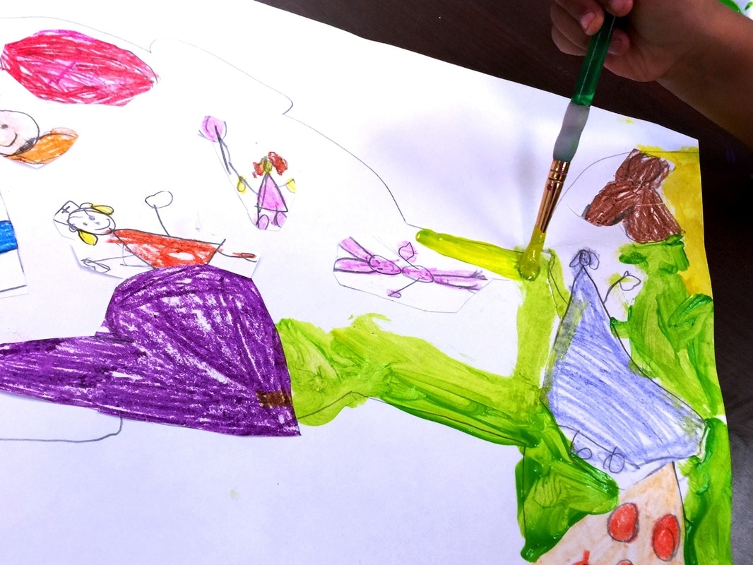      |
Archives
March 2018
Categories
All
|


 RSS Feed
