|
One of my goals this year is to be more intentional about critiquing artwork with my students- analyzing artwork for its successes and identifying areas that could be improved. We often share our work with each other in class, but it often stops there- with just sharing. A true critique needs participation from the viewer, and is a much deeper and purposeful way of looking at art. A well-done critique benefits both the artist and the viewer. First we talked about WHY we critique artwork in the first place. I shared this video- the story of Austin's butterfly and how the critique process shaped his success. It's a GREAT example of having a growth mindset. It's only a few minutes long- it's really worth watching! Today's activity was a small step in the right direction. I introduced a critique method called "Two Stars and a Wish." The viewer makes two positive comments about something he finds successful about the work (these are the "stars") and then one suggestion for improvement (a "wish" to see something changed.)  Instead of critiquing classmates' artwork, I decided to have students critique works by master artists. One reason is that I want to show students that no matter how "good" a work is, there is always something that could be questioned. Chances are good that the artist made that decision on purpose and considers it successful, but the viewer has the right to have a different opinion. For example- one of the works we looked at as a class was one of Picasso's cubist portraits- where the eyes are both on the same side and the nose is off to the other side. One of the "wish" comments was "I wish he hadn't made the eyes crooked." I explained to students that even though Picasso structured the face that way intentionally, and that painting in that style made him famous, that we as the viewers are allowed to not like it. I wanted students to realize that liking or not liking a work of art is a choice each of us makes- our opinions aren't right or wrong. The second reason we began with critiques of master works rather than students' own works is that it's much less intimidating for them! If they can learn to make honest and thoughtful comments about a work they don't have an emotional connection to, then I'm hoping it will make it easier to share truthful opinions about friends' artworks and to hear comments about their own works. Students chose an artwork, wrote 2 stars and a wish, then shared their comments with a partner.    "I like the big 5. I like the details of the picture. I wish the picture had more color."  "I like how the leaves have designs. I like how the red leaf is crooked. I wish it had more color."  "The skull looks realistic. The skull is broken. (I wish) the background was changed to the sky."  "They put good details. They did good work. I wish they had put more color in the faces."  "I love that she put that fan there. I love the necklace that she has on her neck. I wish I knew her."  "The flowers are colorful. The door is colorful. The sunset is colorful. I wish it wasn't creepy."  "I like how he is smoothing it out. (the hat) I like how he drew the moon. I like how he looks at himself. I wish he didn't put a freckle."  "I like the girl's hair.
The mom's dress is so pretty. I wish the dress were pink."
0 Comments
Our schedule has changed a great deal this year. It's been quite an adjustment for both the teachers and the students, but things are settling into place well. We are now using a rotation schedule, and we have A-week, B-week, and C-week. One benefit of the new schedule is that students in 1st-4th grades will have hour-long sessions for Art this year, increased from the 45-minute classes we had in the past. Kindergartners will have half-hour sessions, but will come to Art twice as often. It works out that in each three-week cycle of the rotation, all students will have 2 1/2 hours of Art! Each Friday, all art classes will last only 30 minutes, and each classroom will have one Friday session in each three-week cycle. Since our "Friday Sessions" are so short, we'll use these days for skill-builder exercises, rather than continuing our regular art projects. I'm excited to get to try some new activities with students! This session's activity was based on a new book I discovered over the summer, called "Swatch: the Girl Who Loved Color." Here's a preview video from the publisher- "Swatch" is an imaginative little girl who sees colors as wild, free, creatures. She tries to tame the colors and trap them in jars. She soon realizes that the colors aren't meant to be tamed, and instead should remain free. She releases the colors and they swirl together, making a masterpiece.  Swatch describes her favorite colors with wonderful figurative language. She gives colors names like "rumble-tumble pink", "bravest green", and "in-between gray." After we read the book, students were asked to name their own color and write a description of it.                This artist even drew his own interpretation of Swatch, riding the colors through the sky!  And this artist drew herself as Swatch, complete with stripes of face paint like the character in the book! At the end of the lesson, students shared their color creations with each other.   Welcome back to school! It has been a great first few weeks. Very busy, but great! We started the year with a solar eclipse-themed artwork, to celebrate the "Great American Eclipse" that passed over us on August 21st. We started by looking at some artworks inspired by previous eclipses. We discussed how each artist interpreted the eclipse in a unique way and with a variety of materials.  Representing an eclipse through a pen-and-ink drawing.  And a painting.  With stained glass.  Wood-working techniques.  And quilting! Students then created their own interpretation of the eclipse using a chalk pastel technique. Here are our "Solar Eclipse Silhouettes"!             I love the detail this student added- a drawing of himself wearing his eclipse glasses!!
This map-making project concludes second grade's art lessons for the year. This project fits with the map skills unit students have just completed in social studies. In Art, students learned about cartography- the art of making maps! I started the lesson by showing this 2-minute clip from the Wizard of Oz. It's the scene where Dorothy sees Oz for the very first time. I asked students to imagine that like Dorothy, they were experiencing a new land for the first time. What kind of land would it be? How would things look different? We used these imaginative maps as our inspiration...    (Map images are from the Etsy shop PaintandInk.) My kids were SOO excited to begin this project!! Normally this close to summer, students get a little wild and hard to manage, but these second-graders were the most focused I have seen them all year! They LOVED this project! The requirements for the maps were that they had to show both land and water, have a title, and have a legend/key and a compass rose. Anything else was up to them! I wish I'd started this project a little sooner- we didn't have time to finish. I let students take their maps home with them to complete since we ran out of time. Next year I'll start this project a couple of weeks sooner! Here are some of the in-progress map drawings.       These beautifully painted flower vases were inspired by contemporary artist Heather Galler. Her use of color and pattern is so playful and bright. Her work takes an ordinary subject and turns it into something really special! As one of my kids said, "She made us look at these flowers in a whole new way!" This was our inspiration-  Visit Ms. Galler at this website to see more. Prints of her artwork are available- I just purchased a couple for our art room! Our goal in creating these paintings was to explore pattern. We started by creating the background with construction paper and liquid tempera paint. Students could create any design they wanted! I encouraged them to pay attention to their color choices- did they want their patterns to stand out or blend in?    Our next step was to create the flowers. We did these on squares of construction paper, which were then cut out and glued to the background.     Then we added leaves, and some students chose to embellish their work even more using oil pastels. The finishing touch was to outline the shapes with a line of black paint, just to help everything stand out more. I am THRILLED with how these paintings turned out! Every single day I am amazed by what our kids can accomplish- it makes my time with them so worthwhile!           This series of projects was designed as a way to reinforce geometry terms while exploring design concepts like balance and symmetry. The first project involved lines and angles. Students used rulers to draw several straight lines in a variety of directions. Then they added points and labeled lines, line segments, and rays. Next, students looked at the angles the lines created. They were given a color key and asked to color acute, obtuse, and right angles according to the key.   Project two was all about partitioning shapes evenly. One of the second-grade math standards is being able to divide circles, squares, and rectangles into halves and fourths. Pairs of students received three of each shape and divided them- one whole, one split in half, and one split in fourths. They learned that folding the shapes were a good way to make sure the parts were even. Students used the resulting pieces to create interesting compositions. Instead of gluing the pieces down, they photographed their completed compositions and then arranged the shapes into a new design!     This group made a robot.  This group designed a flower garden with orange clouds.  And this design is my favorite- a crying monster! Week 3's project allowed students to develop their observational drawing skills while reviewing three-dimensional forms. I gave each student a cube, a rectangular prism, and a cylinder. They were to observe each form's edges and faces and replicate them as closely as possible in their drawings. Many students went further and added the shadows and highlights.     Finally, the last project of this series was a review of polygons. Students used rulers and circle-tracers to create shapes. Then they had to count each shape's sides and determine what type of polygon it was in order to color it the assigned color. Shapes that were NOT polygons (ones with curved sides, created by the circle tracers) were colored black or gray.     One of the things I enjoy about teaching Art is that I get to support students' academic learning by integrating those concepts with opportunities for them to explore and create. This second-grade project is a good example of this integration. Students created a landscape of their choosing and used math concepts to guide their drawings. Each student received this checklist-  The kids could draw anything their imaginations could come up with- any kind of tree, any kind of building, any kind of weather... as long as they could answer these questions about their drawings. I was pleased to see some really creative ideas! We only worked on these drawings for two weeks, which was not really enough time to get them as finished as they could be. The kids will keep their work in their folders and can pull it out when they have a few free minutes.          Hendrix is participating in "The Great Kindness Challenge" this week. Each day students are encouraged to do a kind act for someone at our school or in our community. Students have made cards and banners, created homemade gifts, and collaborated on this beautiful display!  These colorful cards were created by several 1st and 2nd grade classes. The students explored color relationships and how new colors are made. Each student used only three paint colors (red, yellow, and blue- the primary colors) and mixed them to create orange, green, and violet (the secondary colors). They were encouraged to try different color combinations. The result is this beautifully unique rainbow!  Each class has discussed what it could mean to "be a rainbow" for someone. We talked about how if someone is having a hard day, your kind act could be all they need to turn their day around. Just like a rainbow at the end of a storm!    * I can't take credit for this idea- the design is based on a bulletin board I saw online, and we made our own version! Here's the original: https://www.pinterest.com/pin/166773992427772517/ Second grade is in the middle of a unit about weather. Part of their instruction involves identifying types of clouds- cumulus, cirrus, and stratus. What could be a better way to learn how clouds look than to go outside and observe them? So we took our painting supplies and headed outside to observe and paint. Fortunately, the weather cooperated for most classes! A couple of classes did not get to go outside yet, but they will have a turn in the coming weeks.     Here are some finished paintings!  Second grade students have just begun a new IB unit involving weather. This week's learning has been all about air. To go along with this topic, we painted with air in the Art room! Each table had some watered-down paint and some eyedroppers. The goal was to get the paint on the paper and then move it around using ONLY air- no brushes, no fingerpainting. I demonstrated several ways of using air (blowing gently, blowing concentrated air through a straw, fanning a puddle with a piece of cardboard) and then it was the students' turn to experiment! 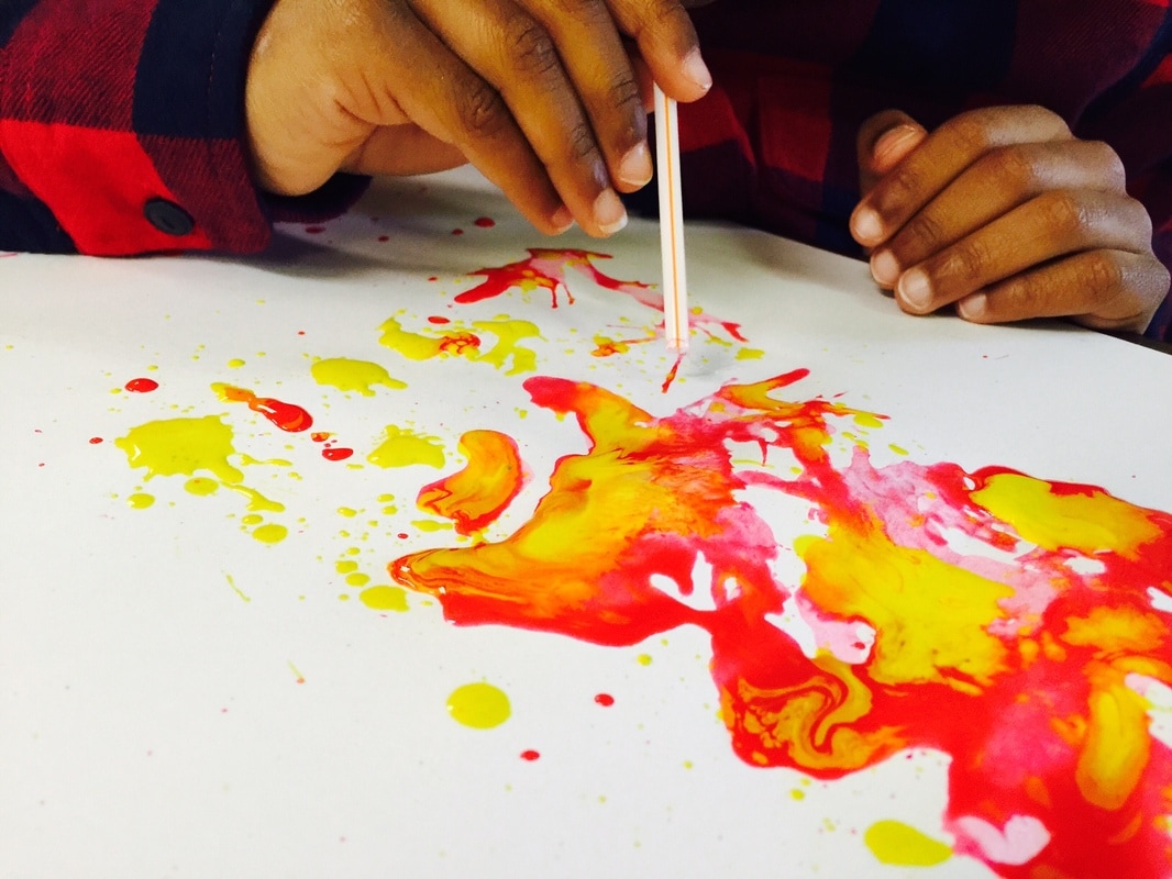     After a few minutes, I stopped them and we had a quick discussion. I asked them what they noticed about how the air worked. One student volunteered that if you blew gently, the paint moved slowly, and if you blew really hard, the paint moved very fast and spread out much further! I was really proud when a student used the word "force" to describe the difference!
Then I asked them what they thought this had in common with weather. They immediately connected it to the wind. We compared the force we used to blow the air to the wind's strength during different weather conditions. They were able to make comparisons between the gentle blowing being like a calm breeze, and the forceful blowing being like hurricane-level winds! We also had to talk a little about color theory... I had given the students red, yellow, and blue paint and the colors swirled and mixed as it moved on the paper. We had a quick review of the concepts behind primary colors (red, yellow, blue) and secondary colors (orange, purple, green- the colors that are made when the primaries mix.) It was a fun day with lots of memorable learning! |
Archives
March 2018
Categories
All
|
 RSS Feed
